
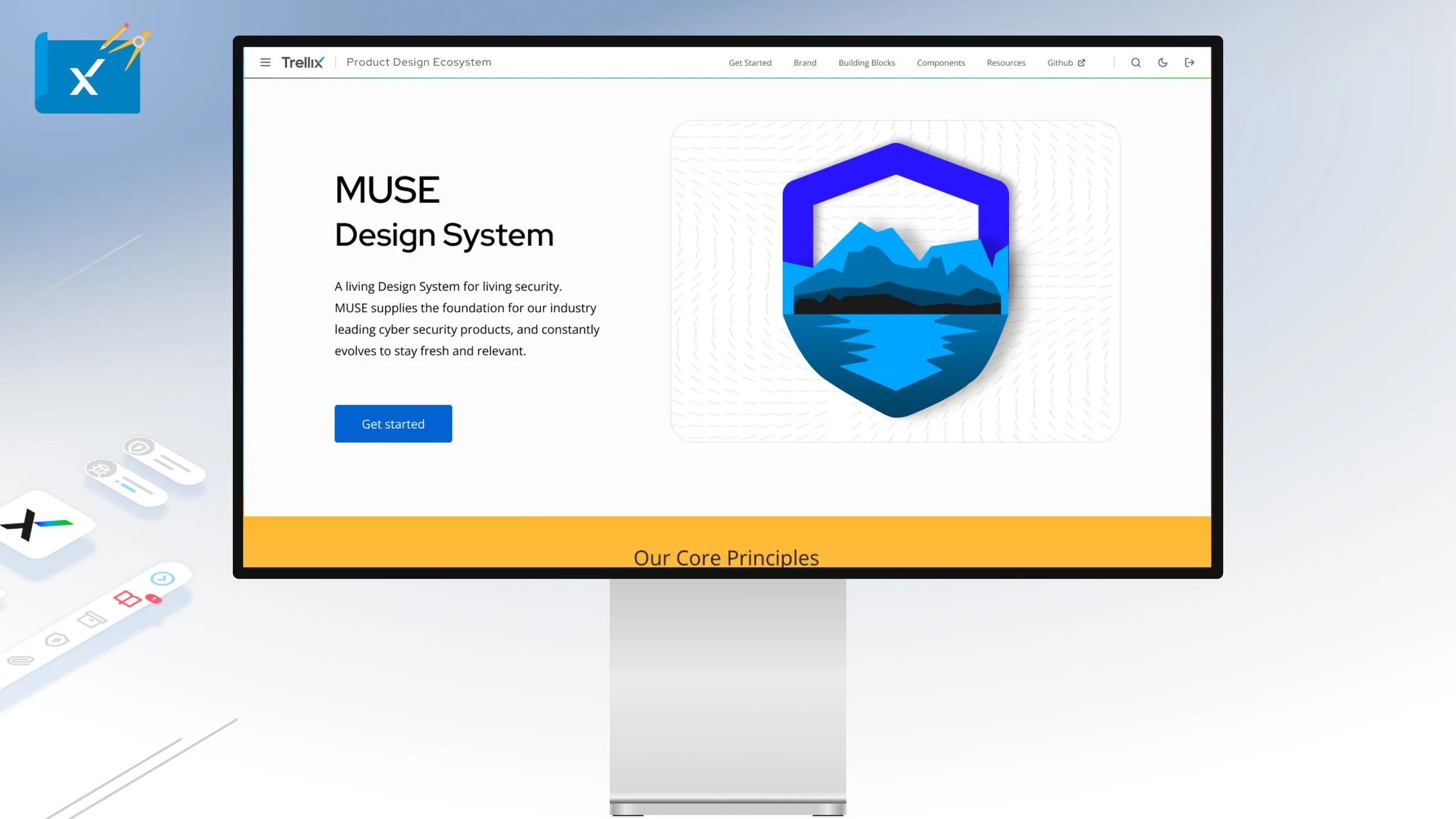


Launched in 2019, the Muse website is the single source of truth tool for UX Designers and developers alike for in depth documentation of the Design System. With each of the 7 major releases, the documentation site continues to grow built on top of a rock solid custom CMS.
NOTE: CLICK ‘+’ BUTTON IN THE UPPER RIGHT CORNER TO EXPAND
Leveraging Pendo we are able to determine new Trellix users to the Muse Design System. This page gives a clear understanding of Muse’s core principles, mission, features, what’s new, design and development resources.
NOTE: CLICK ‘+’ BUTTON IN THE UPPER RIGHT CORNER TO EXPAND
For regular and returning users the Muse homepage serves as a visual launch point to the design system’s information architecture, version history/new features, featured blogs, and a high level refresher to the Muse family of products - The core design system, react library, UI architecture, Figma UI Kit, GitHub Issues and Roadmap.
NOTE: CLICK ‘+’ BUTTON IN THE UPPER RIGHT CORNER TO EXPAND
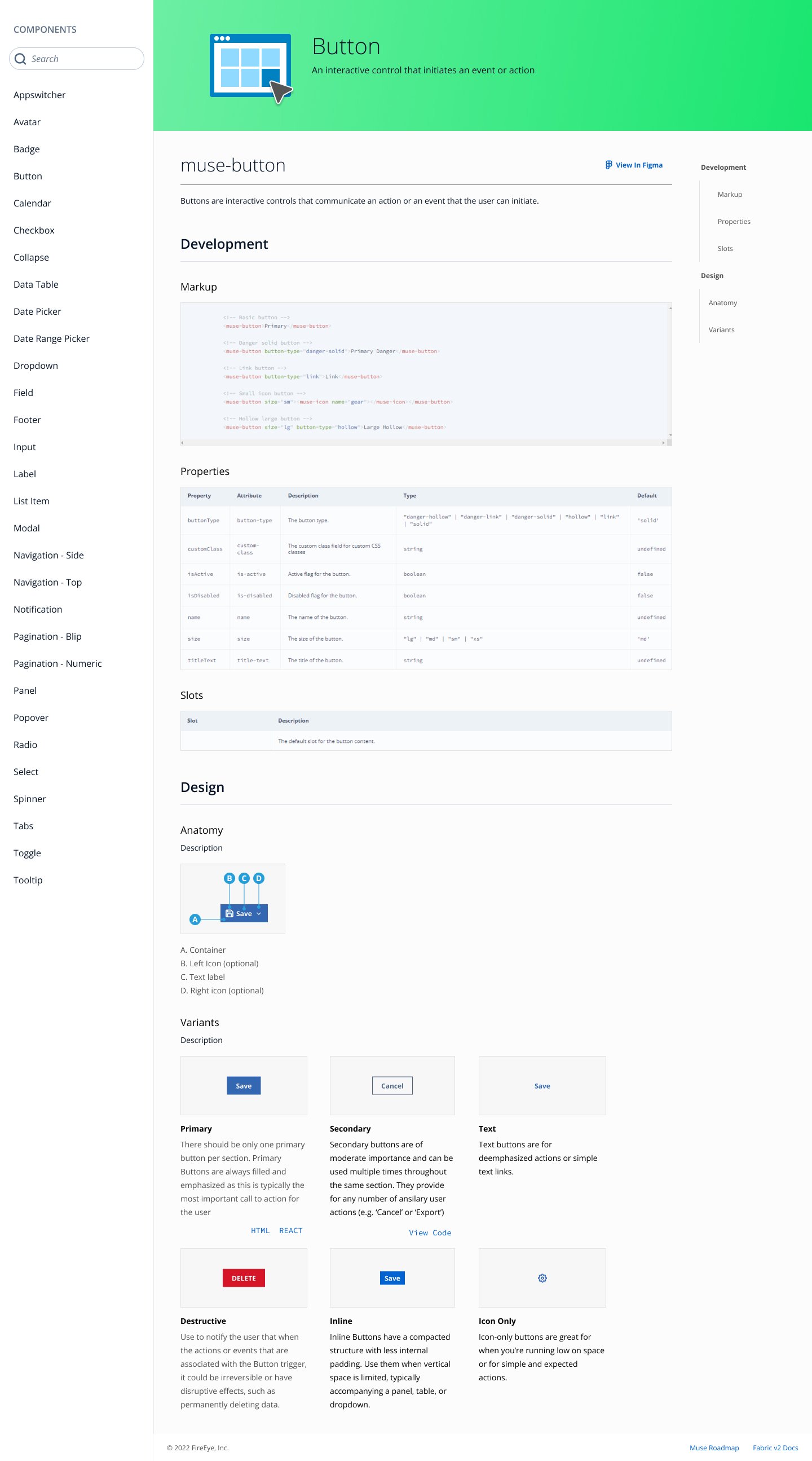
Muse is majority driven by it’s component library. This caters to rapid consumption of data, rapid navigation and simplified visual reference for each of the 38 components in light and dark theming.
NOTE: CLICK ‘+’ BUTTON IN THE UPPER RIGHT CORNER TO EXPAND
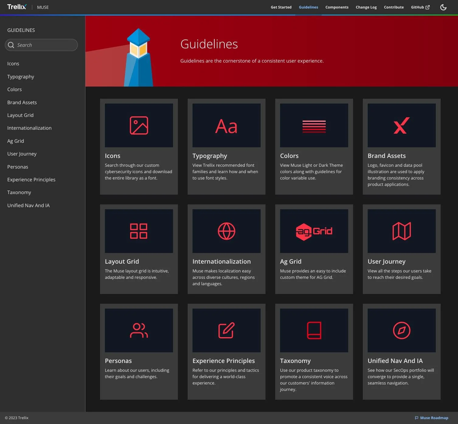
Guidelines are the cornerstone of a consistent Muse based user experience. While components make up the building blocks of the design system, guidelines are the foundation or the guardrails. Made up of basic elements like grid layout, color/theming, typography and icons. This page is made to rapidly navigated and visually consumed.
NOTE: CLICK ‘+’ BUTTON IN THE UPPER RIGHT CORNER TO EXPAND
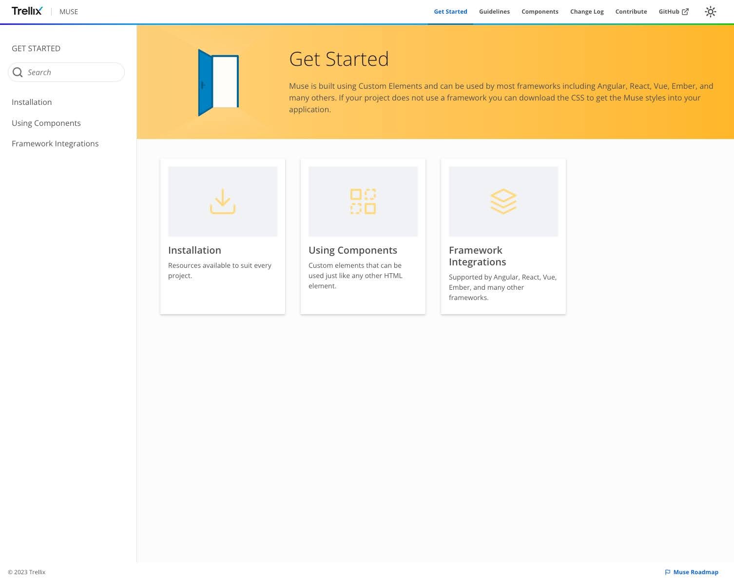
This is the starting point for the majority of developers to begin to use Muse for their product experience. Muse core is built using custom elements and can be used most frameworks including Angular, React, Vue, and many others. We also accommodate a base usage of CSS. Additionally this is drives usage of Muse React and the Muse UI Architecture.
NOTE: CLICK ‘+’ BUTTON IN THE UPPER RIGHT CORNER TO EXPAND
Muse’s change log has been historically tracked from day one from the alpha stage. Muse packages are versioned semantically following the conventional commit guidelines as well as features, bug fixes, and general changes. Lastly the GitHub Issues pages has been integrated for easy access.
NOTE: CLICK ‘+’ BUTTON IN THE UPPER RIGHT CORNER TO EXPAND
NOTE: CLICK ‘+’ BUTTON IN THE UPPER RIGHT CORNER TO EXPAND
NOTE: CLICK ‘+’ BUTTON IN THE UPPER RIGHT CORNER TO EXPAND
NOTE: CLICK ‘+’ BUTTON IN THE UPPER RIGHT CORNER TO EXPAND
NOTE: CLICK ‘+’ BUTTON IN THE UPPER RIGHT CORNER TO EXPAND
NOTE: CLICK ‘+’ BUTTON IN THE UPPER RIGHT CORNER TO EXPAND
NOTE: CLICK ‘+’ BUTTON IN THE UPPER RIGHT CORNER TO EXPAND
NOTE: CLICK ‘+’ BUTTON IN THE UPPER RIGHT CORNER TO EXPAND
NOTE: CLICK ‘+’ BUTTON IN THE UPPER RIGHT CORNER TO EXPAND
NOTE: CLICK ‘+’ BUTTON IN THE UPPER RIGHT CORNER TO EXPAND
NOTE: CLICK ‘+’ BUTTON IN THE UPPER RIGHT CORNER TO EXPAND
NOTE: CLICK ‘+’ BUTTON IN THE UPPER RIGHT CORNER TO EXPAND
NOTE: CLICK ‘+’ BUTTON IN THE UPPER RIGHT CORNER TO EXPAND
NOTE: CLICK ‘+’ BUTTON IN THE UPPER RIGHT CORNER TO EXPAND
NOTE: CLICK ‘+’ BUTTON IN THE UPPER RIGHT CORNER TO EXPAND
NOTE: CLICK ‘+’ BUTTON IN THE UPPER RIGHT CORNER TO EXPAND
NOTE: CLICK ‘+’ BUTTON IN THE UPPER RIGHT CORNER TO EXPAND
NOTE: CLICK ‘+’ BUTTON IN THE UPPER RIGHT CORNER TO EXPAND
NOTE: CLICK ‘+’ BUTTON IN THE UPPER RIGHT CORNER TO EXPAND
NOTE: CLICK ‘+’ BUTTON IN THE UPPER RIGHT CORNER TO EXPAND
NOTE: CLICK ‘+’ BUTTON IN THE UPPER RIGHT CORNER TO EXPAND