


NOTE: CLICK ‘+’ BUTTON IN THE UPPER RIGHT CORNER TO EXPAND
Muse to be is a living, breathing, versioned product that is easily adopted by engineers and governed in collaboration with key stake holders. Muse to provides a beautiful, consistent, useful and usable experience that makes UX Design and UI development easy for teams.
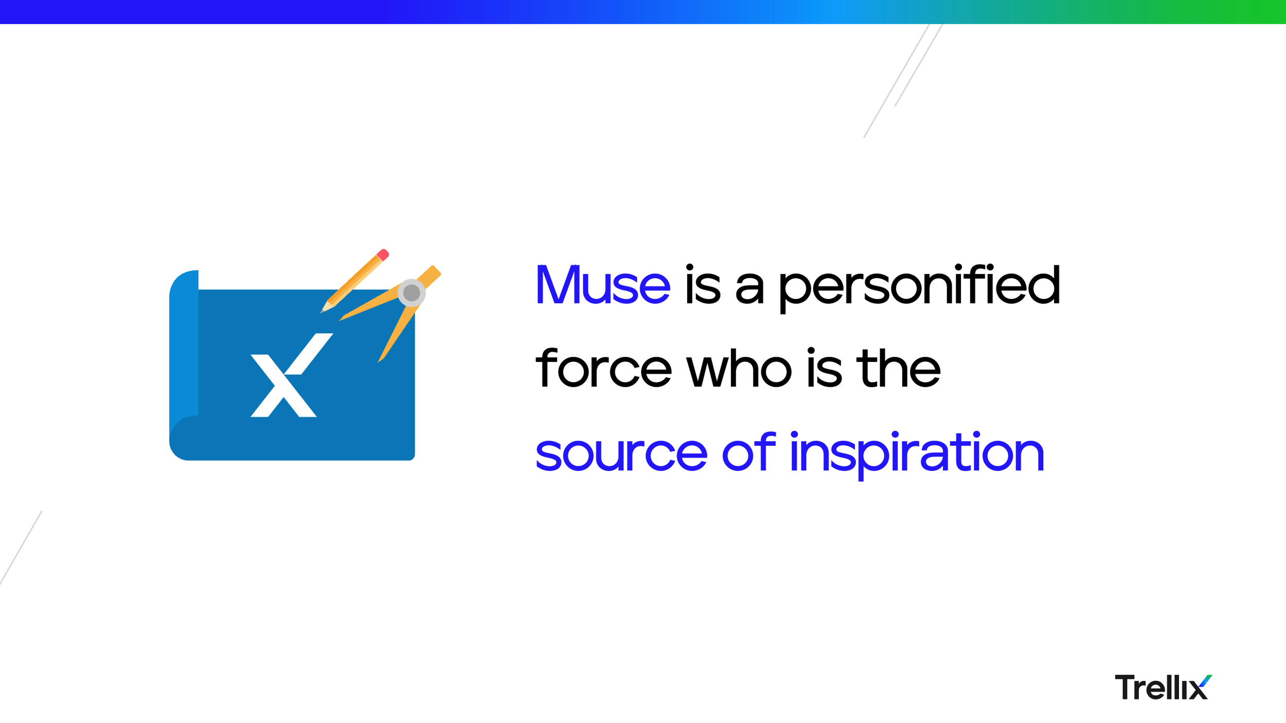
The name Muse itself was chose intentionally to be catalyst for innovation. By definition Muse is a personified force who is the sources of inspiration.
Muse comprises three core products that expand the capability of a traditional design system. 1. Muse Core: The primary design system embodied by the Figma UI Kit and code agnostic unopinionated stencil-based UI code that works across all products. 2. Muse React: Explicitly developed for new Trellix experiences, it is an opinionated version of Muse that provides deep functionality per component. 3. Muse Advance: Packages up Core and React within a micro front-end architecture and tool that converges legacy and new products.
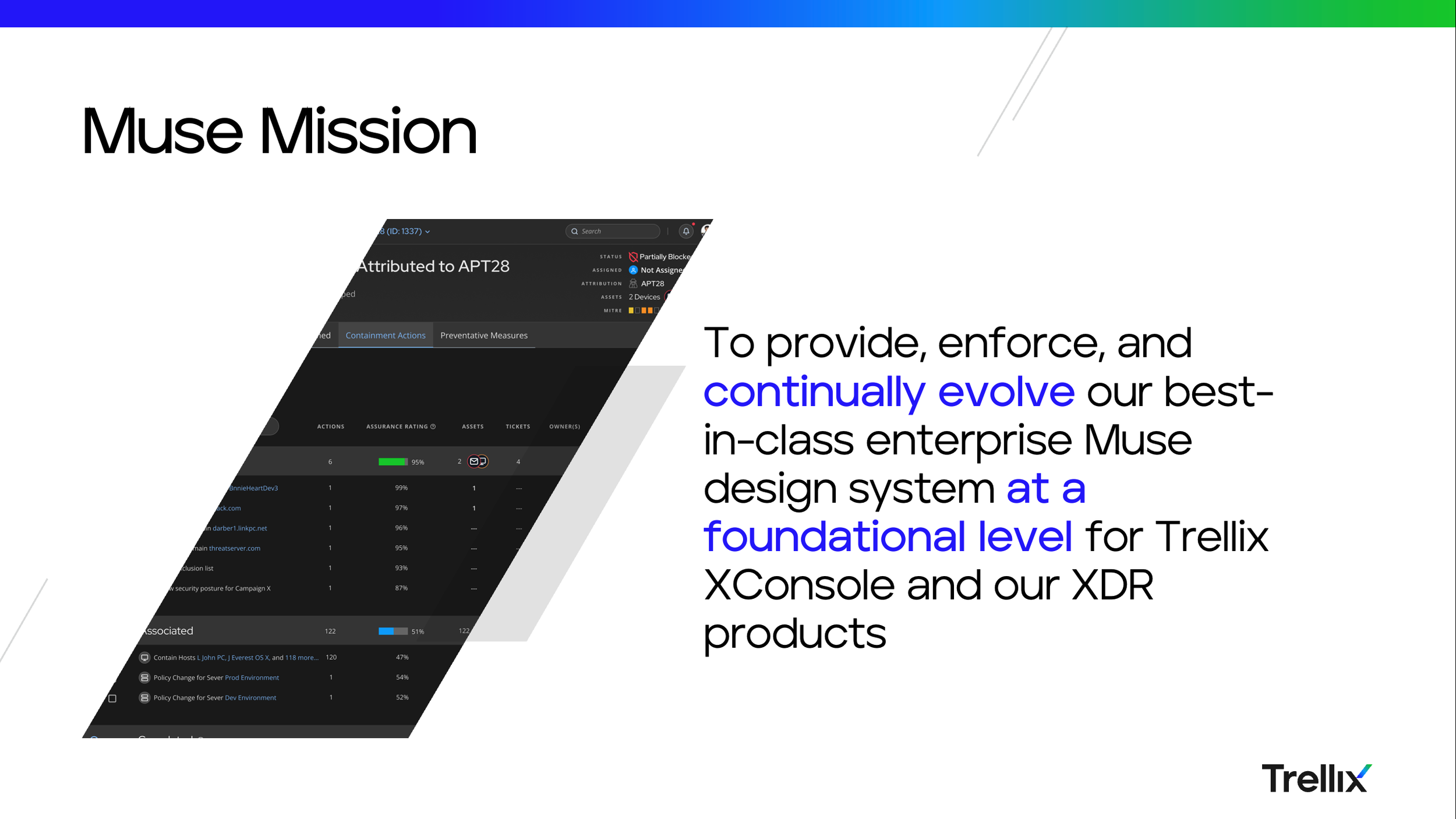
The Ecosystem team continually delivers and evolves the Muse Design System tools, design, methodology, guidance, and direct UI development to drive sustainably accelerated experience convergence with the XConsole and across Trellix products. Ultimately, to ensure industry-leading beautiful and consistent user experiences and make customers, prospects, and industry analysts feel like they are working with one company.
Translating UX strategy into living code via Muse, the XConsole UI development team, and education to enable rapid and consistent implementation of experience convergence for our products at scale.
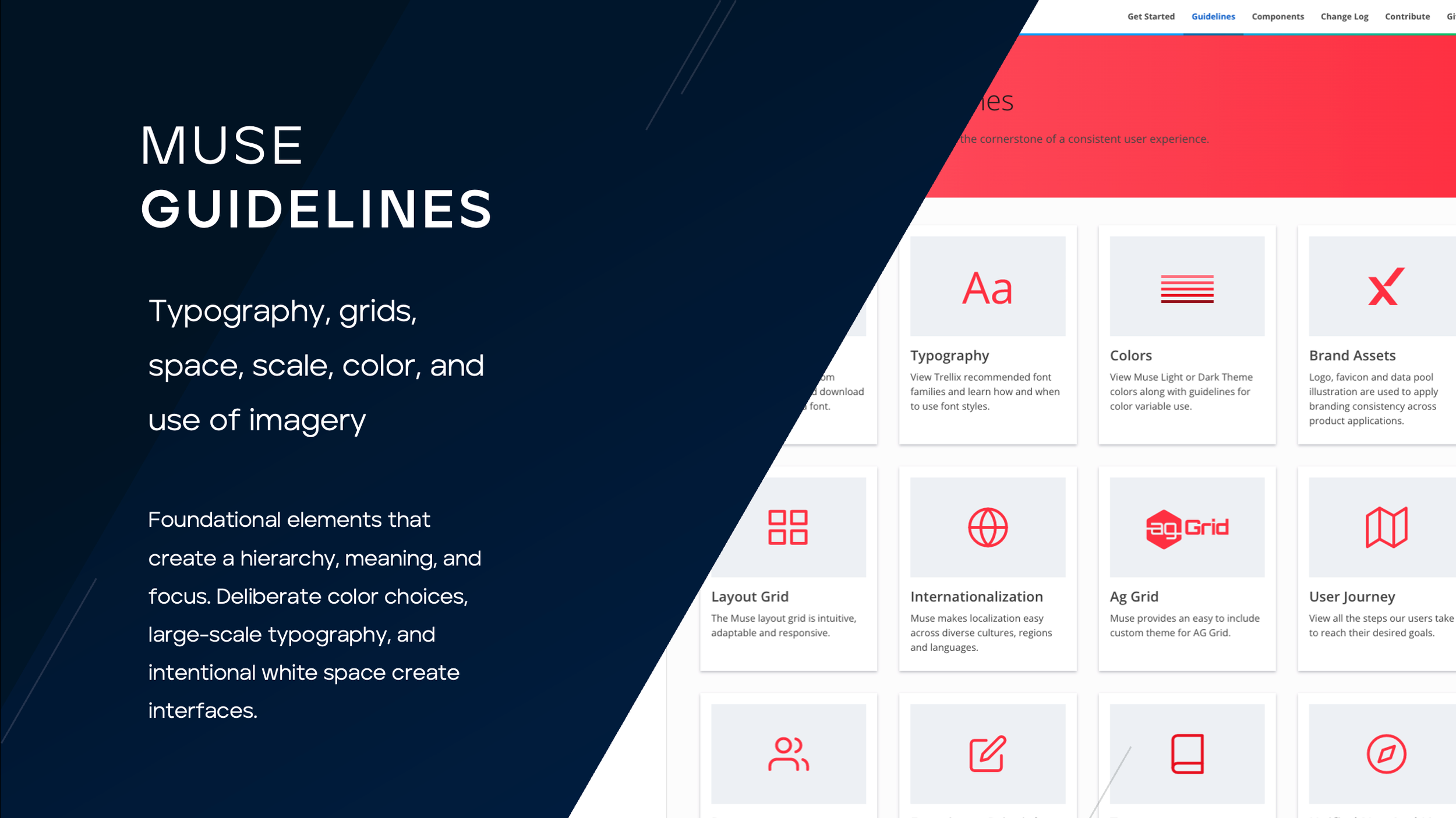
For the purposes of consistency and learnability across products - each of the 215 searchable icons has a clearly defined usage.
NOTE: REPEATEDLY CLICK THE NEXT BUTTON to view all 41 components, 12 guidelines, light and dark color themes.
NOTE: CLICK ‘+’ BUTTON IN THE UPPER RIGHT CORNER TO EXPAND
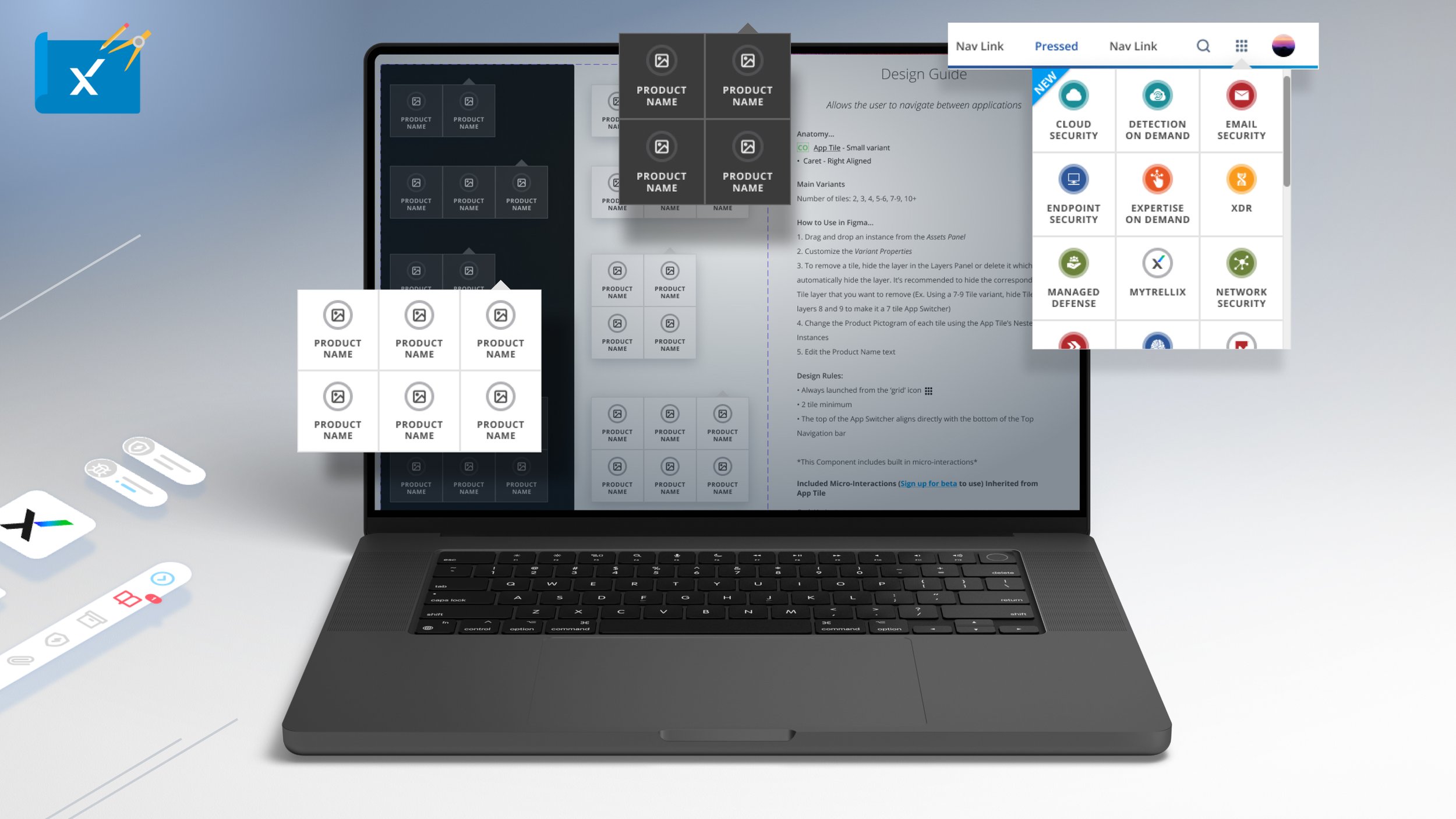
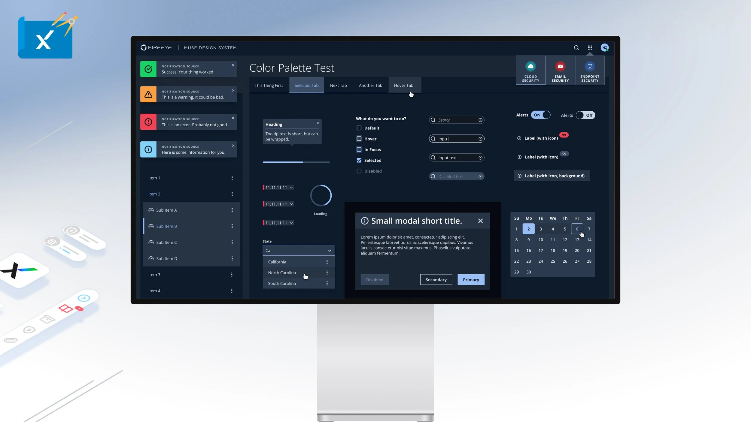
The App Switcher component is to be used specifically with the Mega Menu and Top Navigation within XConsole. Given the expanding product library the component can easily slot new app tiles up to six upon which a scroll bar is enabled.
NOTE: CLICK ‘+’ BUTTON IN THE UPPER RIGHT CORNER TO EXPAND
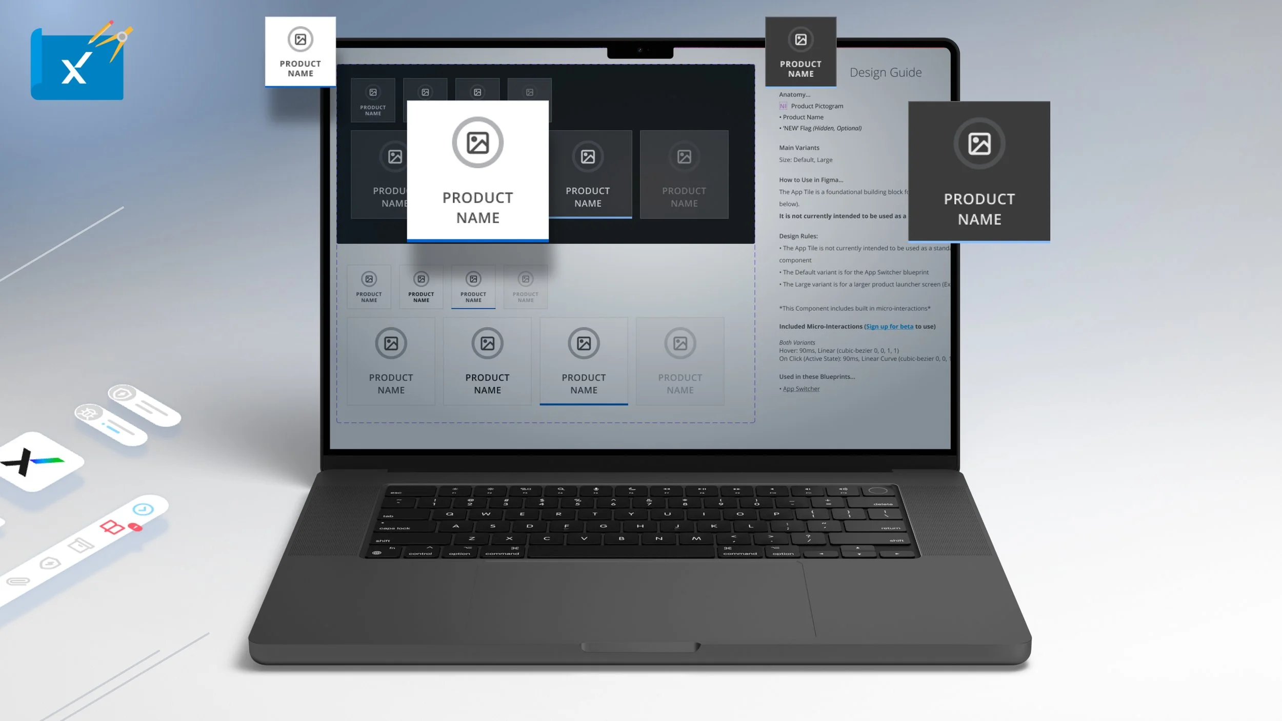
The App tile is fundamental to the App Switcher but can also be used standalone for login, onboarding and feature pages.
NOTE: CLICK ‘+’ BUTTON IN THE UPPER RIGHT CORNER TO EXPAND
The avatar component is a visual representation of a user, login, or organization that has a default state based on Okta data, or can display a custom image.
NOTE: CLICK ‘+’ BUTTON IN THE UPPER RIGHT CORNER TO EXPAND
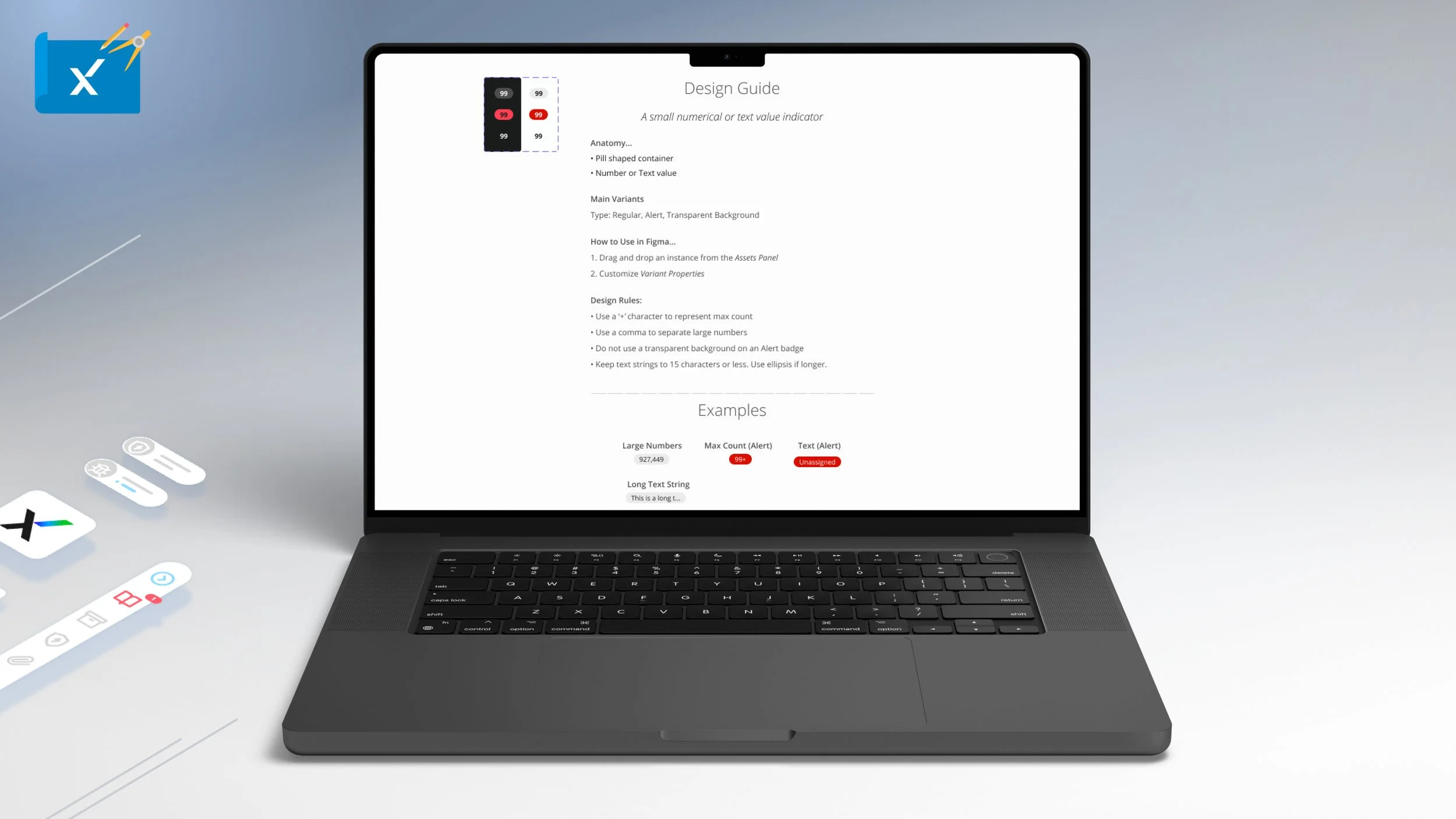
The Badge component is a small pill shaped numerical or text value indicator that is used through most Trellix experiences.
NOTE: CLICK ‘+’ BUTTON IN THE UPPER RIGHT CORNER TO EXPAND
The button component is a ubiquitous interactive that initiates an action or command. There are nine types of Muse buttons each having four variants based on specified needs.
NOTE: CLICK ‘+’ BUTTON IN THE UPPER RIGHT CORNER TO EXPAND
The breadcrumb is a secondary navigation component that displays the current page and allows the user to navigate page hierarchy. The breadcrumb is meant to be used sparingly, never to replace primary navigation and can be used horizontally or vertically.
NOTE: CLICK ‘+’ BUTTON IN THE UPPER RIGHT CORNER TO EXPAND
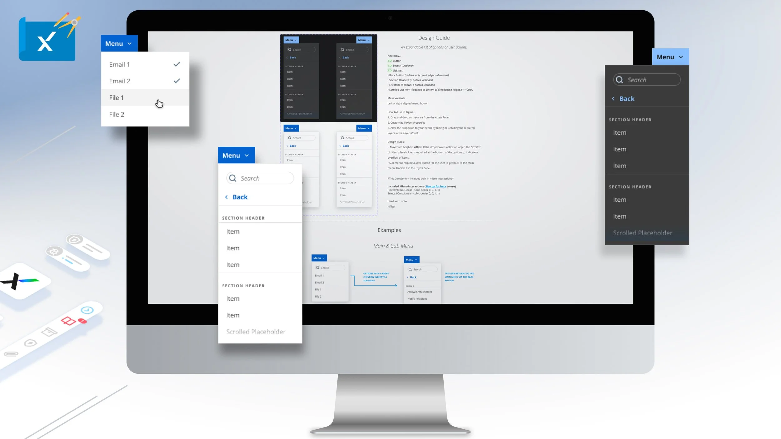
The Dropdown component is an expandable list of options or user actions that is flexible and used heavily throughout Trellix product experiences.
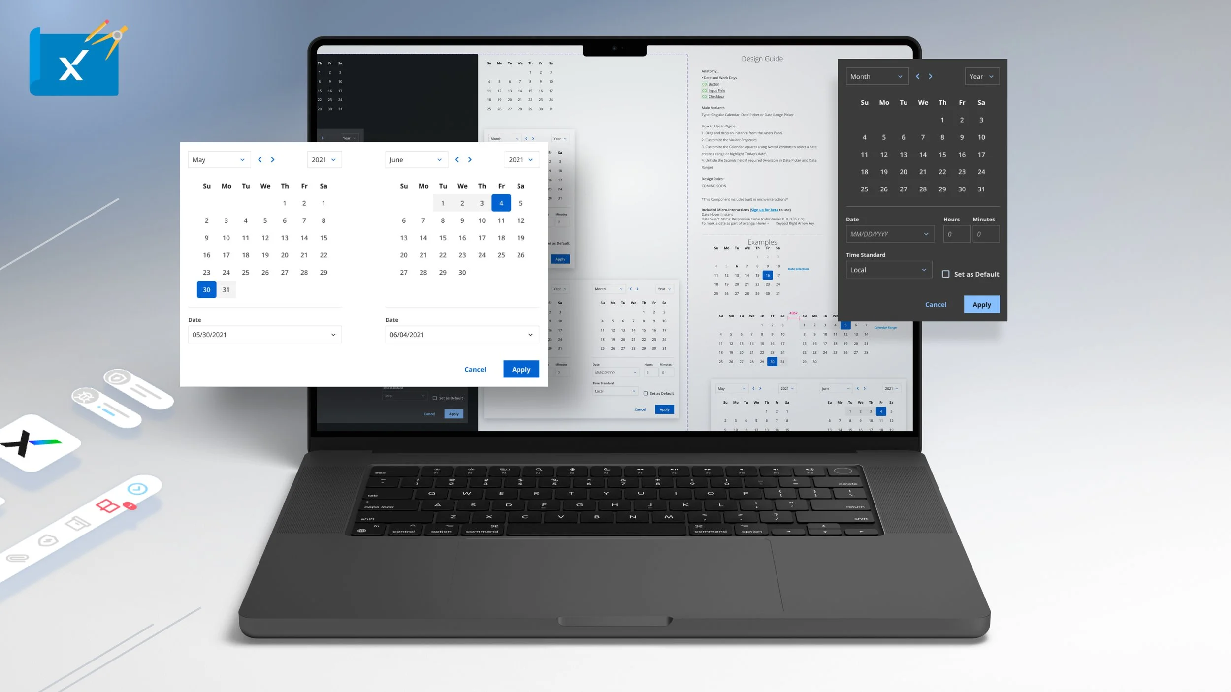
NOTE: CLICK ‘+’ BUTTON IN THE UPPER RIGHT CORNER TO EXPAND
The calendar is a complex component with four types for date or date range selection.
NOTE: CLICK ‘+’ BUTTON IN THE UPPER RIGHT CORNER TO EXPAND
The checkbox component allows user to select one or more items and can be standalone or oriented either horizontally or vertically as a group.
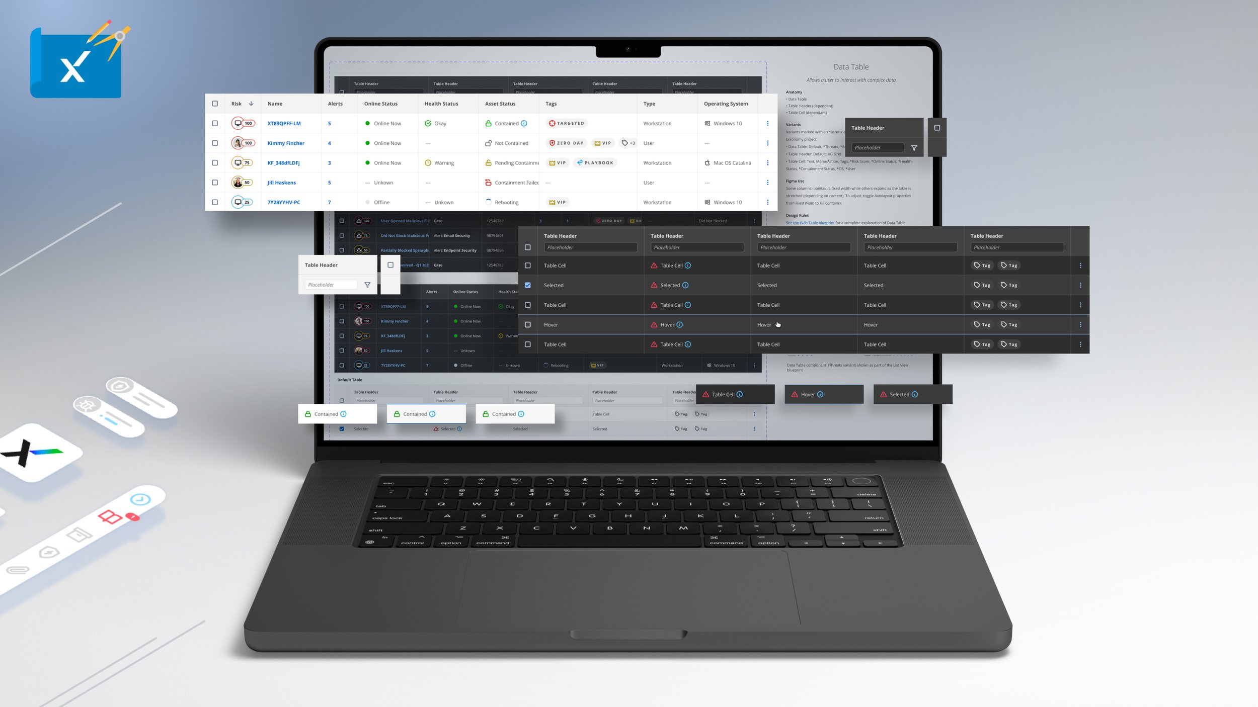
NOTE: CLICK ‘+’ BUTTON IN THE UPPER RIGHT CORNER TO EXPAND
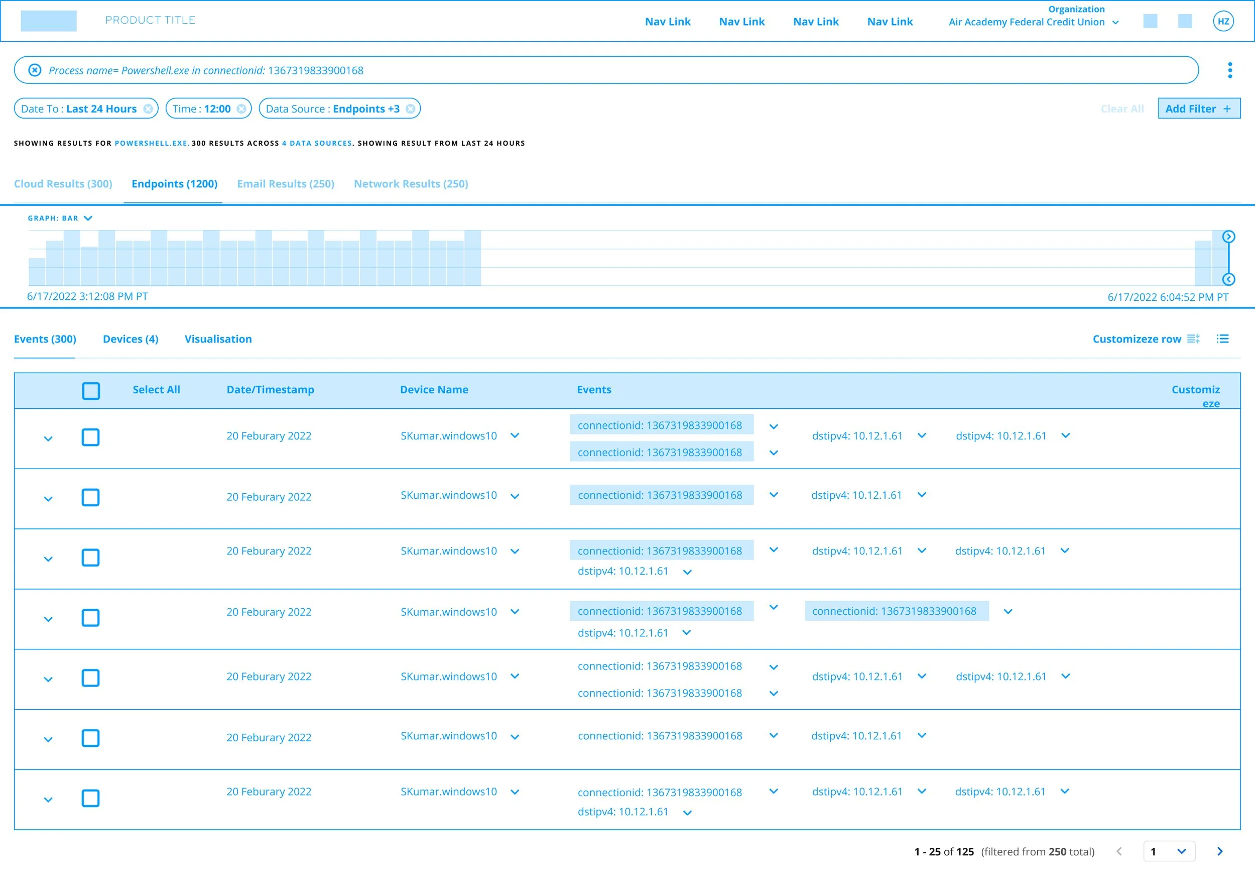
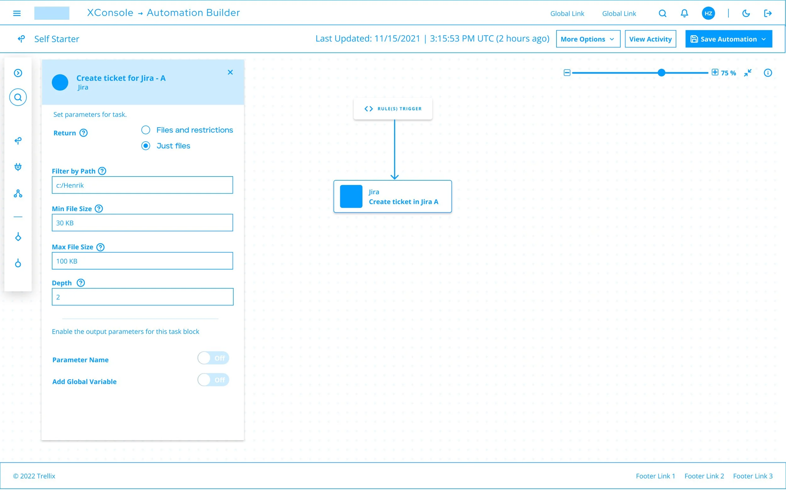
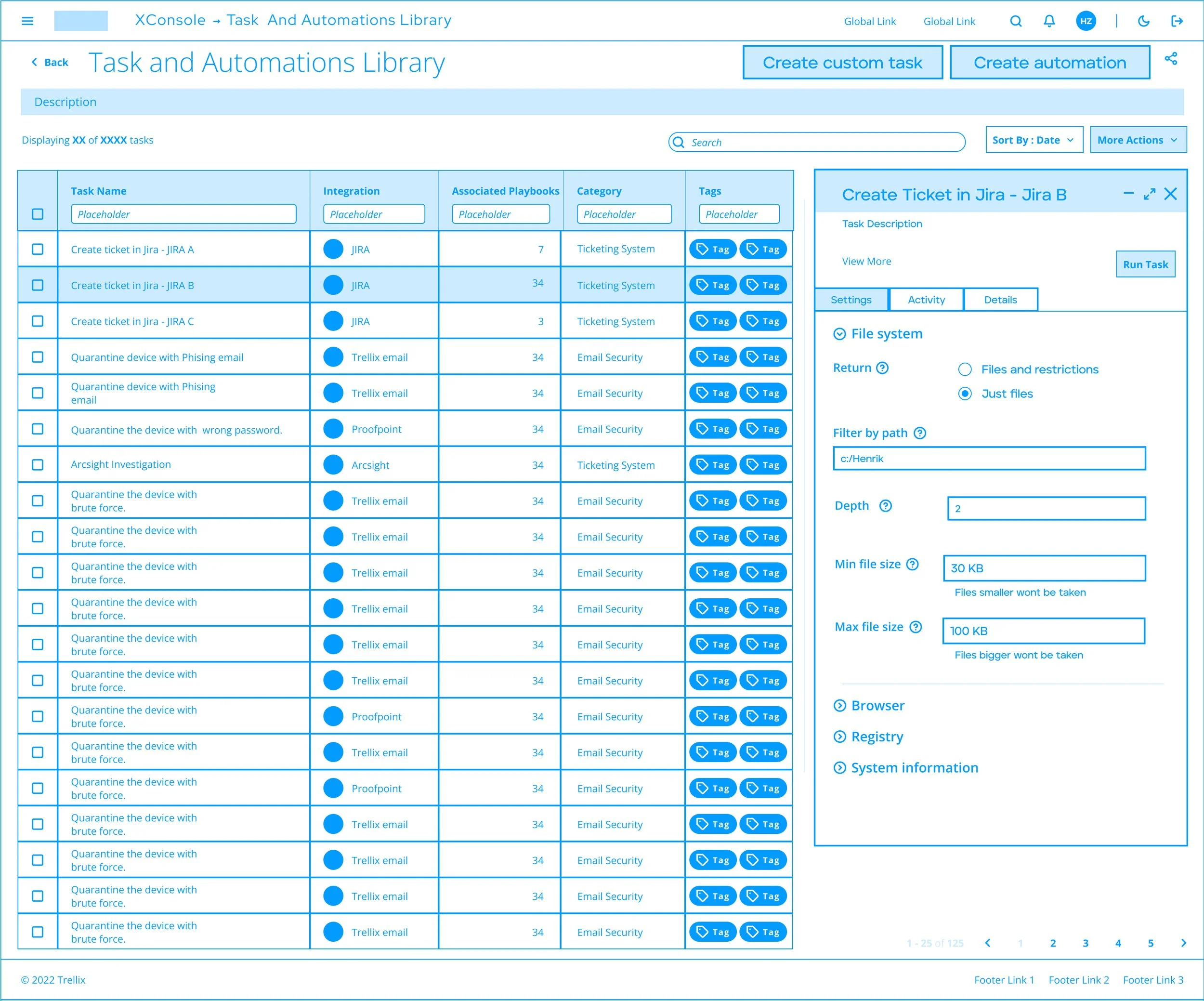
The data table an advanced and endlessly configurable ag-grid based component that allows users to assess and interact with complex data.
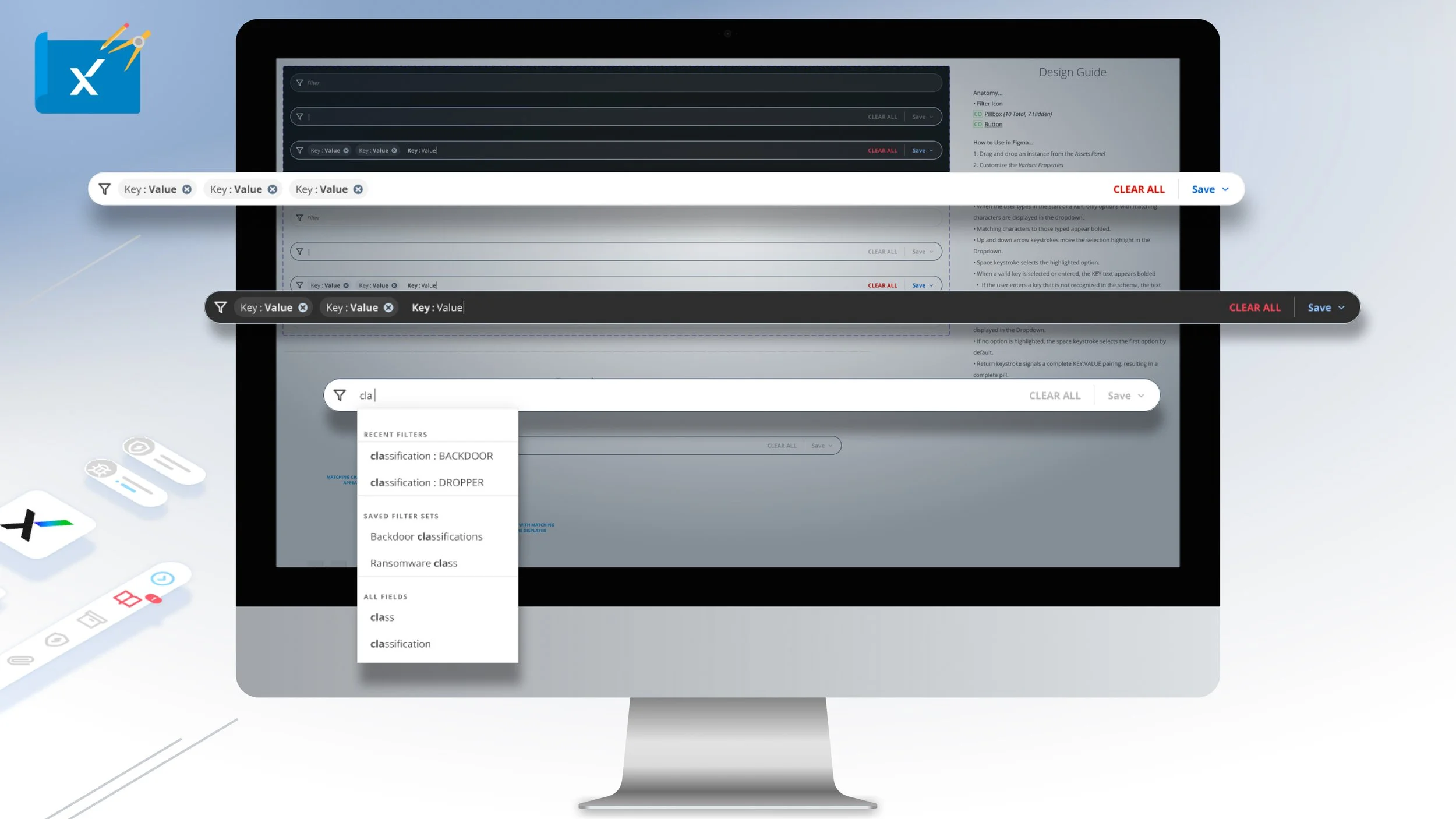
NOTE: CLICK ‘+’ BUTTON IN THE UPPER RIGHT CORNER TO EXPAND
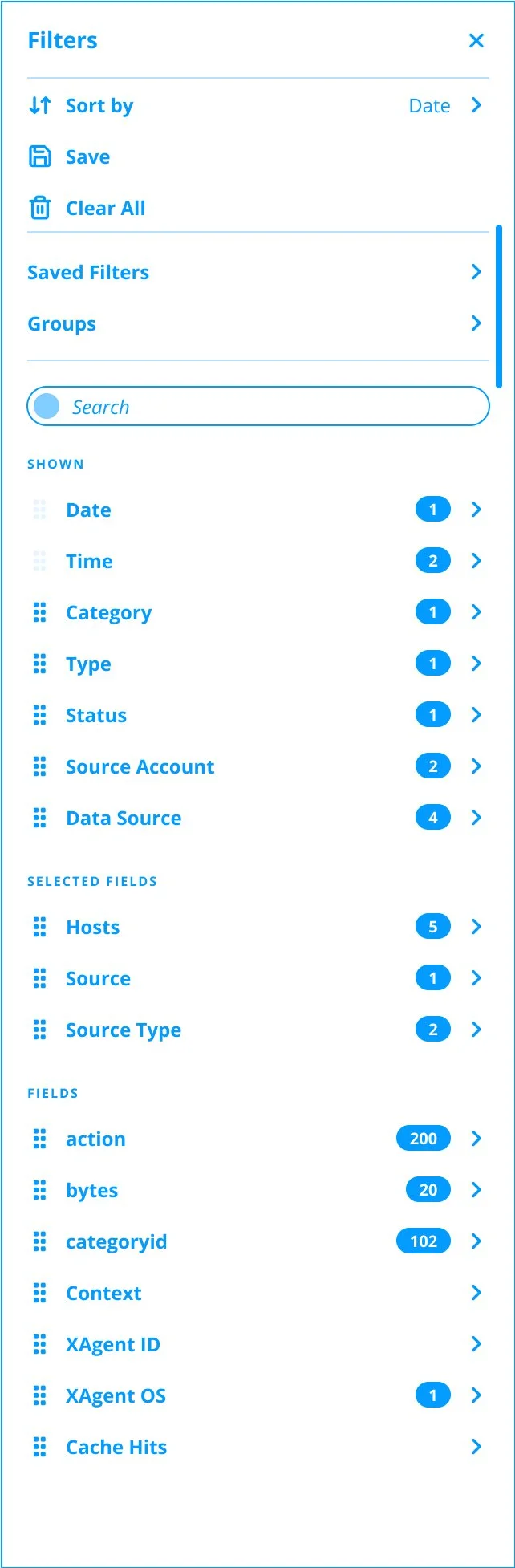
The Filter component is used to enter, search and edit key values to be saved to sort data.
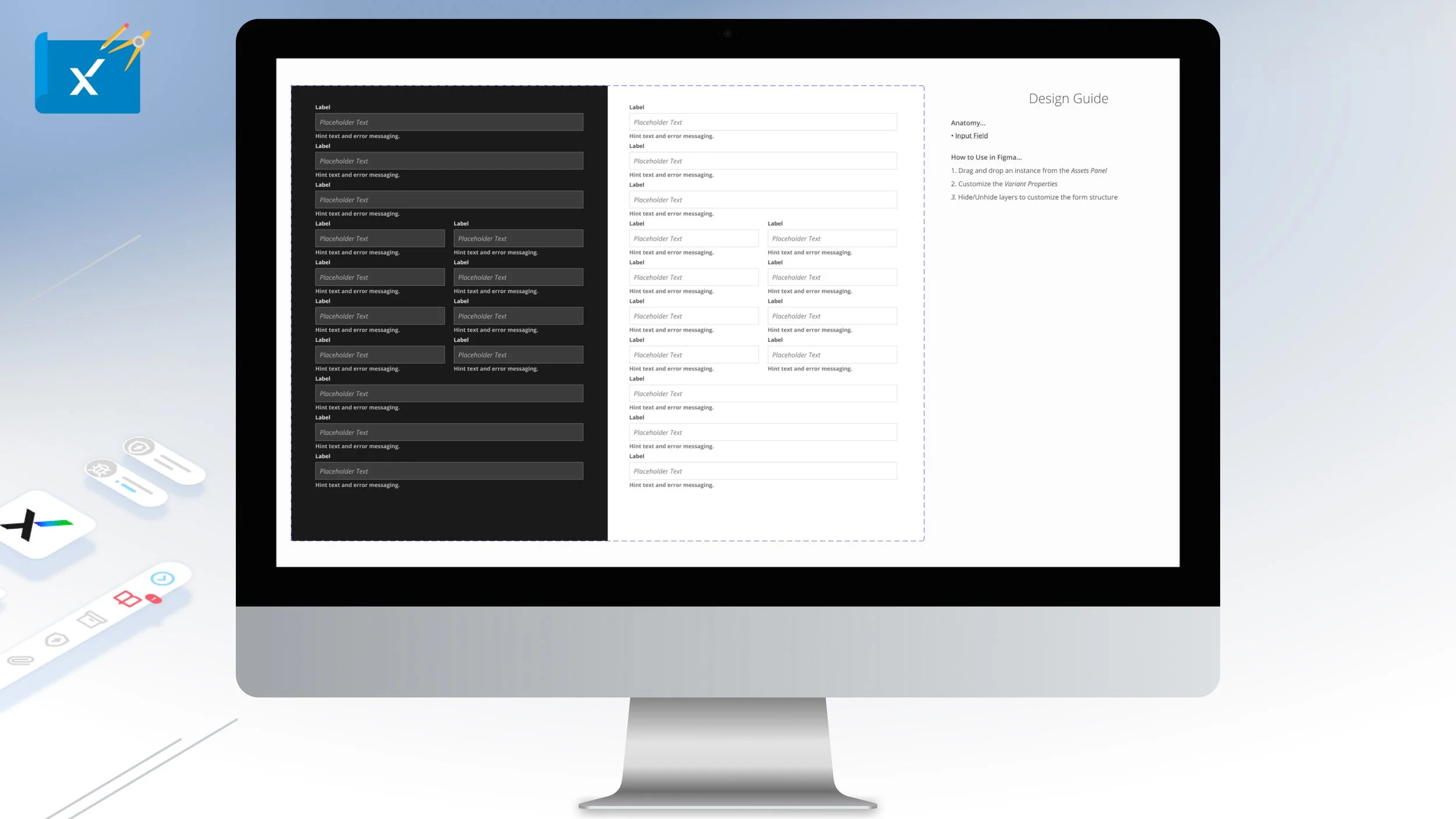
NOTE: CLICK ‘+’ BUTTON IN THE UPPER RIGHT CORNER TO EXPAND
The form is flexible template like component that quickly organizes form fields.
NOTE: CLICK ‘+’ BUTTON IN THE UPPER RIGHT CORNER TO EXPAND
The Input Field component to allows users to type data or text with guidance information and errors states with six types. It is often used in combination with the dropdown component and is keyboard navigable.
NOTE: CLICK ‘+’ BUTTON IN THE UPPER RIGHT CORNER TO EXPAND
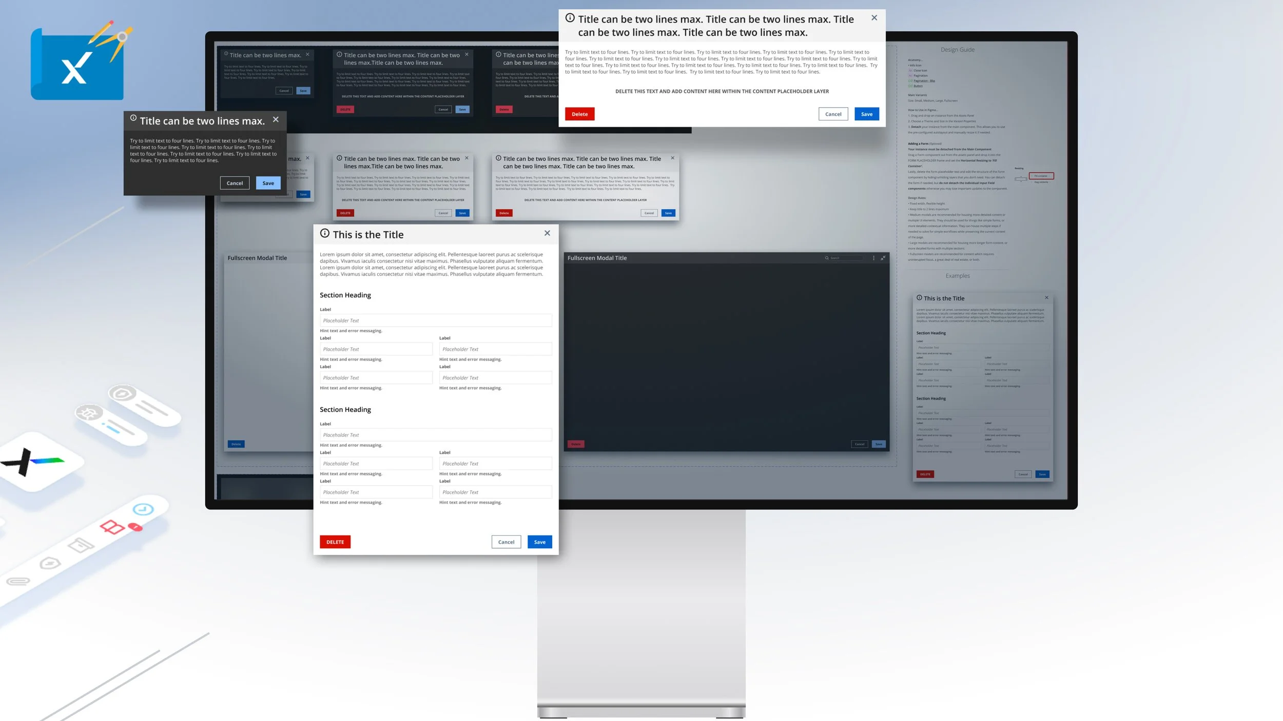
The Modal component is comprised of three types and is an element that displays in front of and deactivates all other page content with scrim or blur applied to the background. To return to the main content, the user must engage with the modal by completing an action or by closing it.
NOTE: CLICK ‘+’ BUTTON IN THE UPPER RIGHT CORNER TO EXPAND
The Mega Menu is the main contextual navigation components that can expand up to three columns with search, notifications, and user profile settings. It is to be always used in conjunction with the Top Navigation component and can be open and closed via the hamburger buttons. Upon expansion, a scrim or blur is applied to page content.
NOTE: CLICK ‘+’ BUTTON IN THE UPPER RIGHT CORNER TO EXPAND
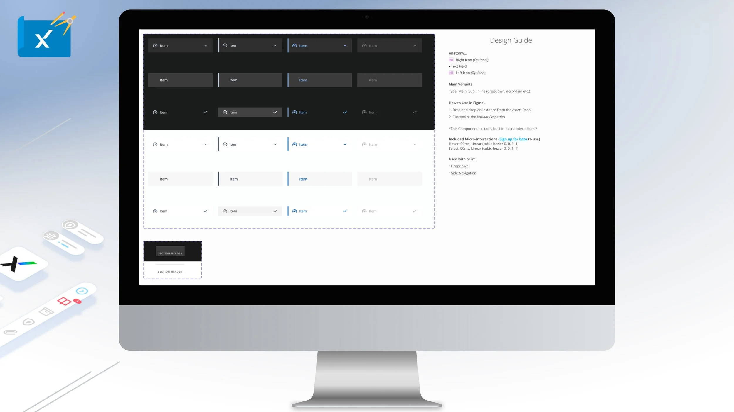
The List Item component is the primary building block of Dropdown and Side Navigation. It has three types with four variants for single or multi selection, dropdown, action to be accompanied with a section header.
NOTE: CLICK ‘+’ BUTTON IN THE UPPER RIGHT CORNER TO EXPAND
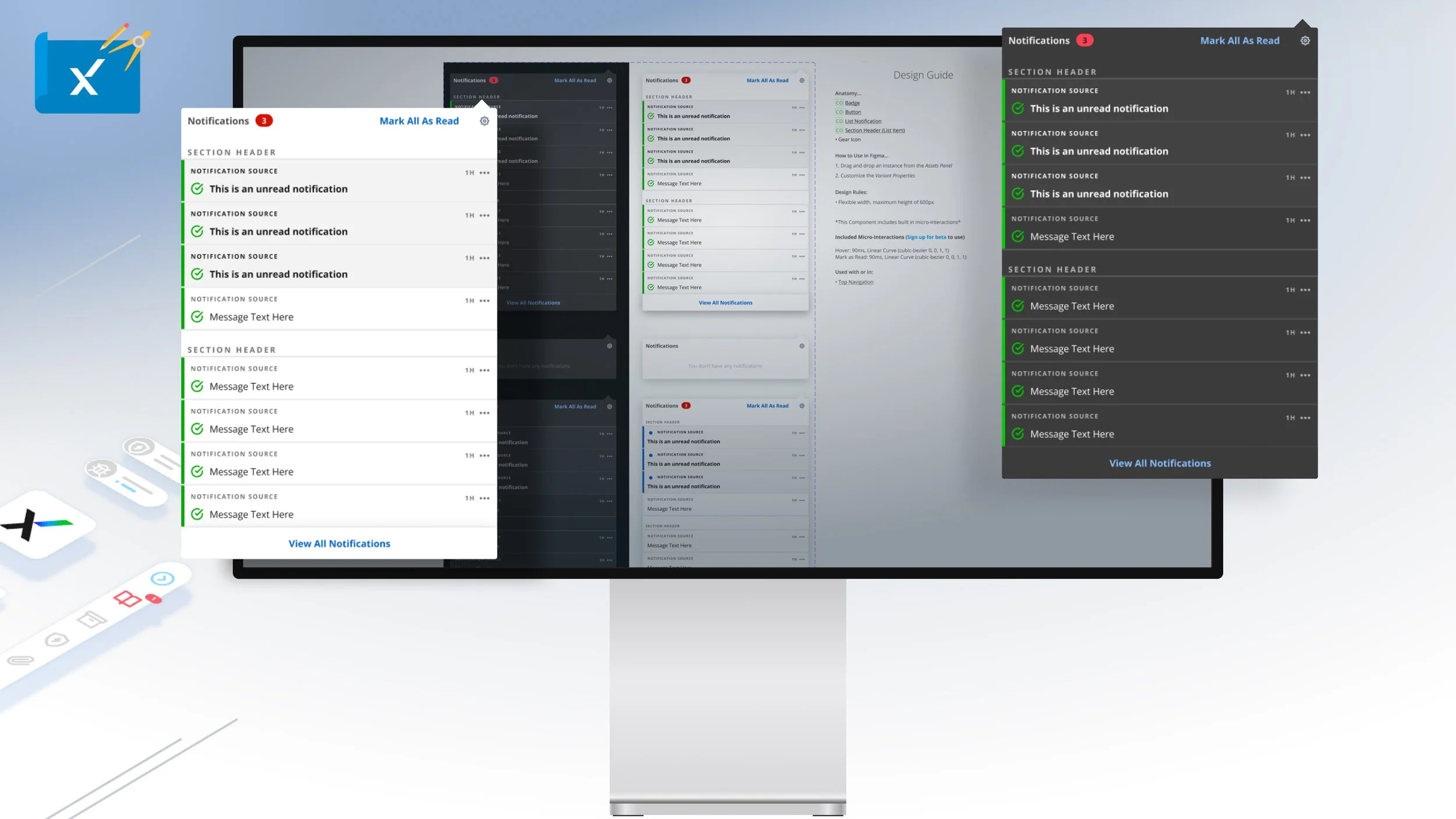
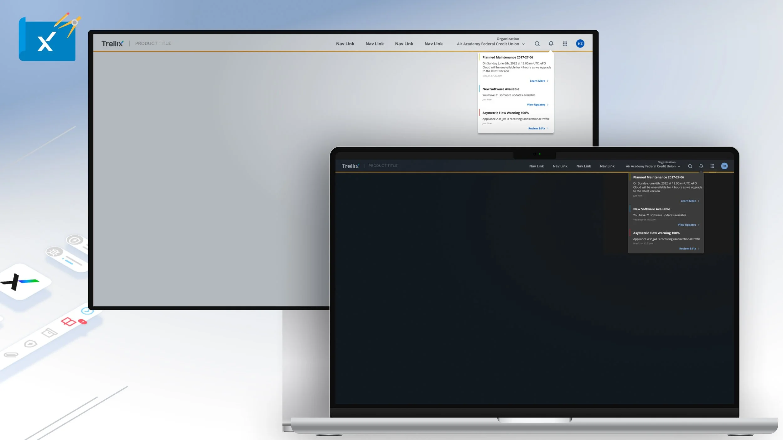
The Notification Dropdown is an expandable component made up of notifications which users can take action on or view in detail.
NOTE: CLICK ‘+’ BUTTON IN THE UPPER RIGHT CORNER TO EXPAND
The Notification component informs users about system or user initiated actions or events. The condense version of the banner notification is designed to be mainly used with the global notifications dropdown. In total there are seven types to choose from.
NOTE: CLICK ‘+’ BUTTON IN THE UPPER RIGHT CORNER TO EXPAND
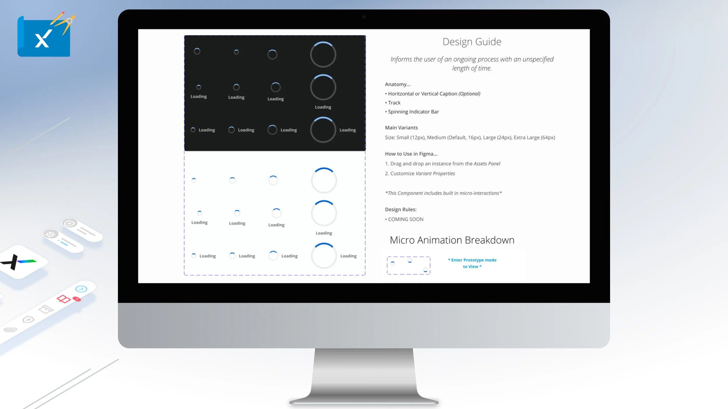
The loading spinner is an animated component informs users of an ongoing process with in indeterminant length of time. There are four types and four variants of the spinner.
NOTE: CLICK ‘+’ BUTTON IN THE UPPER RIGHT CORNER TO EXPAND
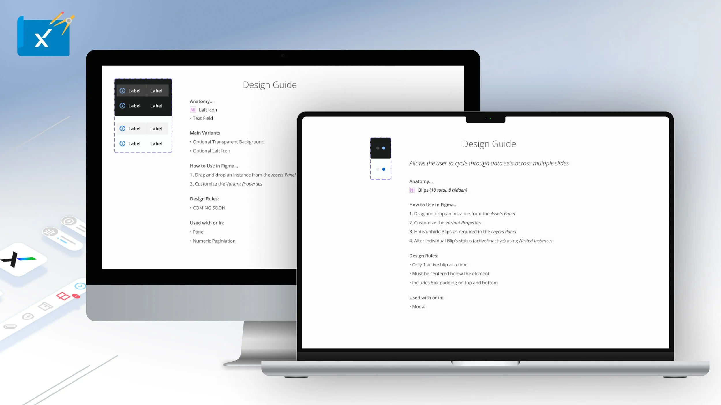
The Blip Pagination component allows user through data sets across multiple slides with a maximum of ten visible elements allowing only one at a time.
The label component displays information either statically or expandable to be mainly used with the Panel and Numeric Pagination components.
NOTE: CLICK ‘+’ BUTTON IN THE UPPER RIGHT CORNER TO EXPAND
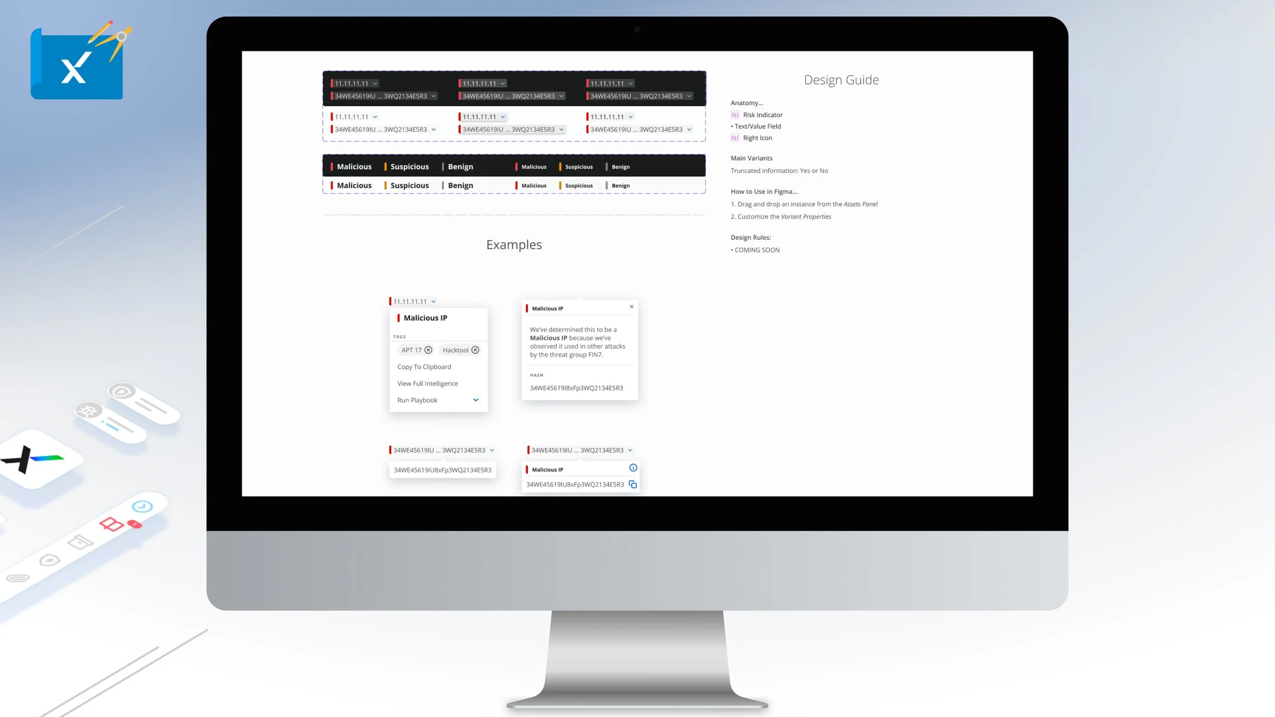
Intel enrichment is specific identifiers and risk indicators within the cyber security industry. The Intel Enrichment component should be always accompanied with a tool tip to provide additional information.
NOTE: CLICK ‘+’ BUTTON IN THE UPPER RIGHT CORNER TO EXPAND
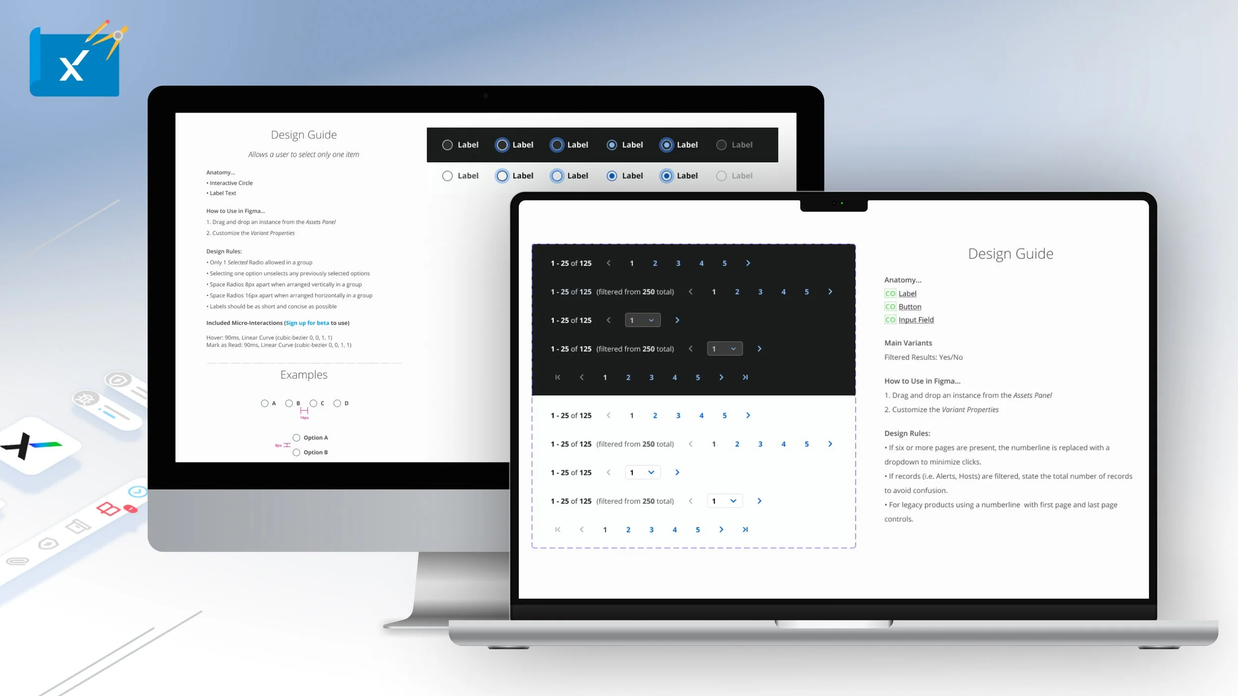
The Numeric Pagination component is leveraged to indicate the previous page or the next page in a given sequence. If six or more pages are present, the number line is replaced with a dropdown. There a six unique types of numeric pagination.
The Radio component or button type allows users to select only one item. It can be used as a radio group either horizontally or vertically.
NOTE: CLICK ‘+’ BUTTON IN THE UPPER RIGHT CORNER TO EXPAND
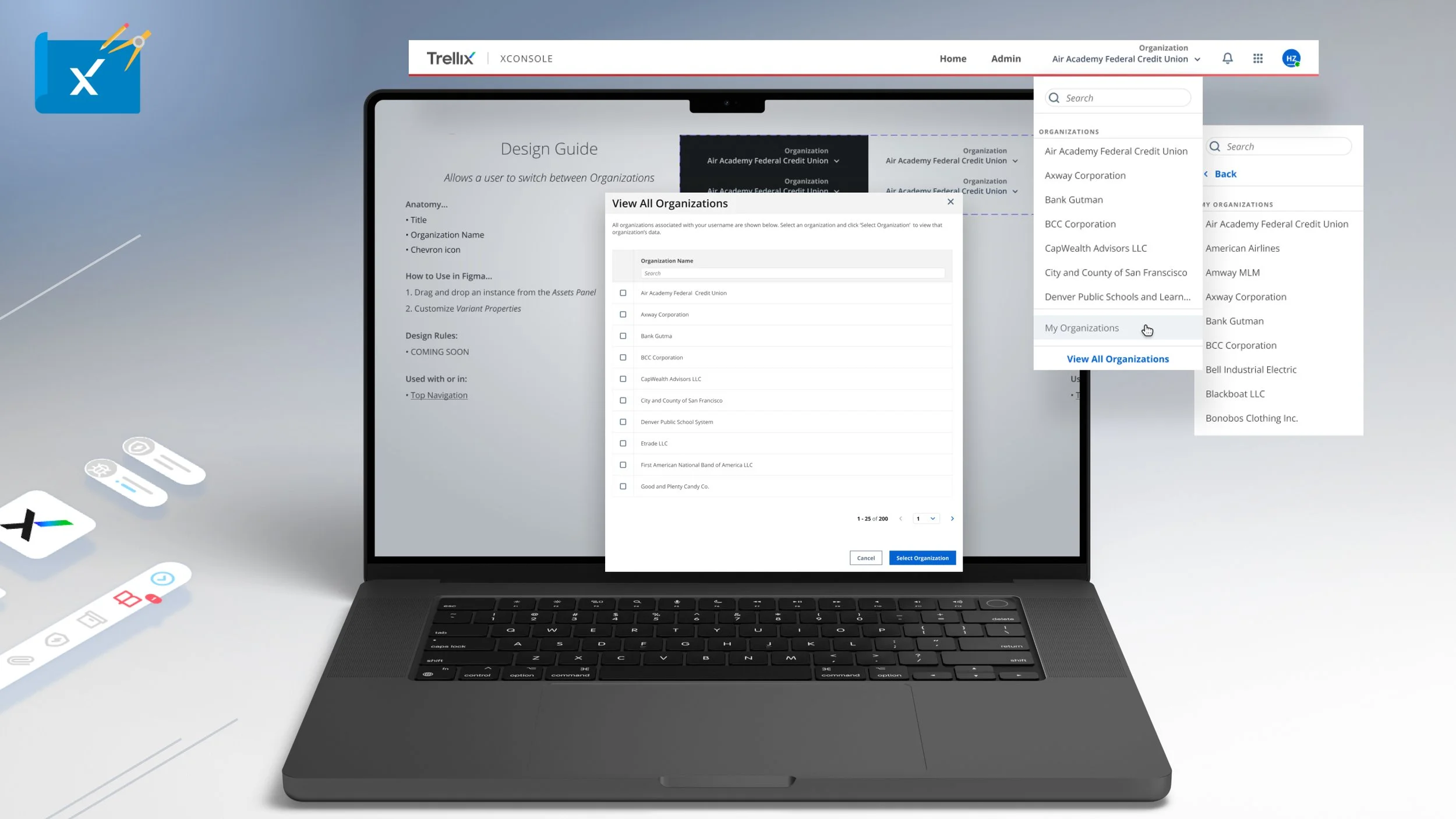
The Org Switcher component allows users to switch between Okta enabled organization. It is to be only used with the Top Navigation component. There are three types of Org Switchers for use.
NOTE: CLICK ‘+’ BUTTON IN THE UPPER RIGHT CORNER TO EXPAND
The Panel component is the primary way of displaying content or data to be leveraged with most components and can be static or expandable/collapsible with overflow content.
NOTE: CLICK ‘+’ BUTTON IN THE UPPER RIGHT CORNER TO EXPAND
The Progress Bar is an animated component allows user to track typically increasing or is some cases decreasing time or progress with supporting description text.
NOTE: CLICK ‘+’ BUTTON IN THE UPPER RIGHT CORNER TO EXPAND
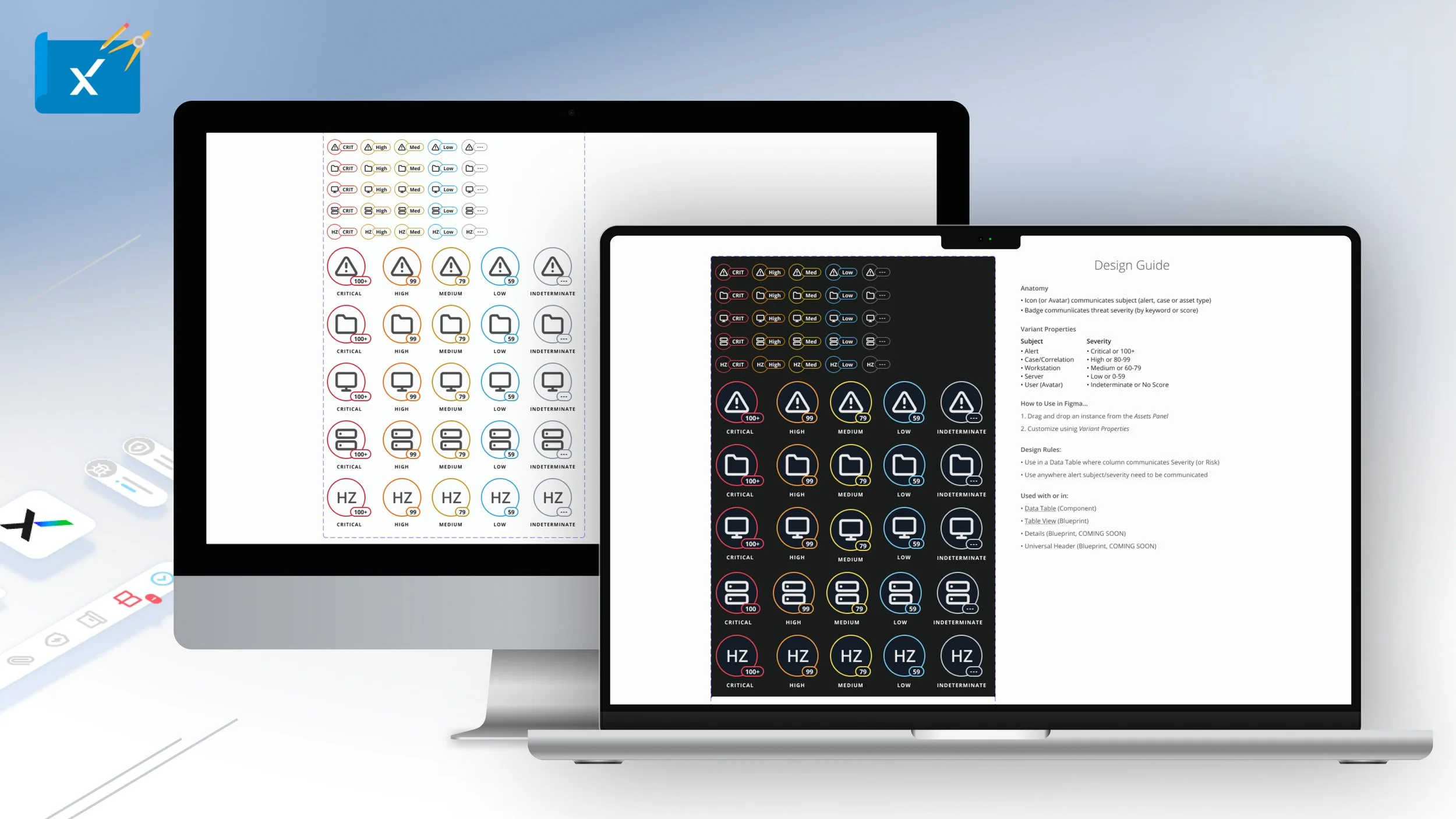
The Severity Badge Component or icon that communicates alert, case, asset type, or threat severity by keyword or score.
NOTE: CLICK ‘+’ BUTTON IN THE UPPER RIGHT CORNER TO EXPAND
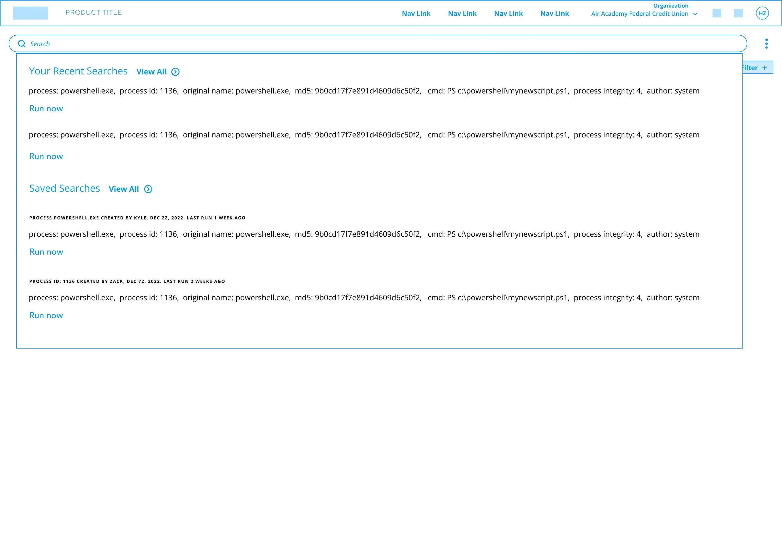
The Search component allows user to query information or data that can be leveraged with dropdown, mega menu, side navigation and panels.
NOTE: CLICK ‘+’ BUTTON IN THE UPPER RIGHT CORNER TO EXPAND
The Mega Menu Utilities is a component to be only used with the top navigation or Mega Menu. It is to leverage to display notifications or user profile actions.
NOTE: CLICK ‘+’ BUTTON IN THE UPPER RIGHT CORNER TO EXPAND
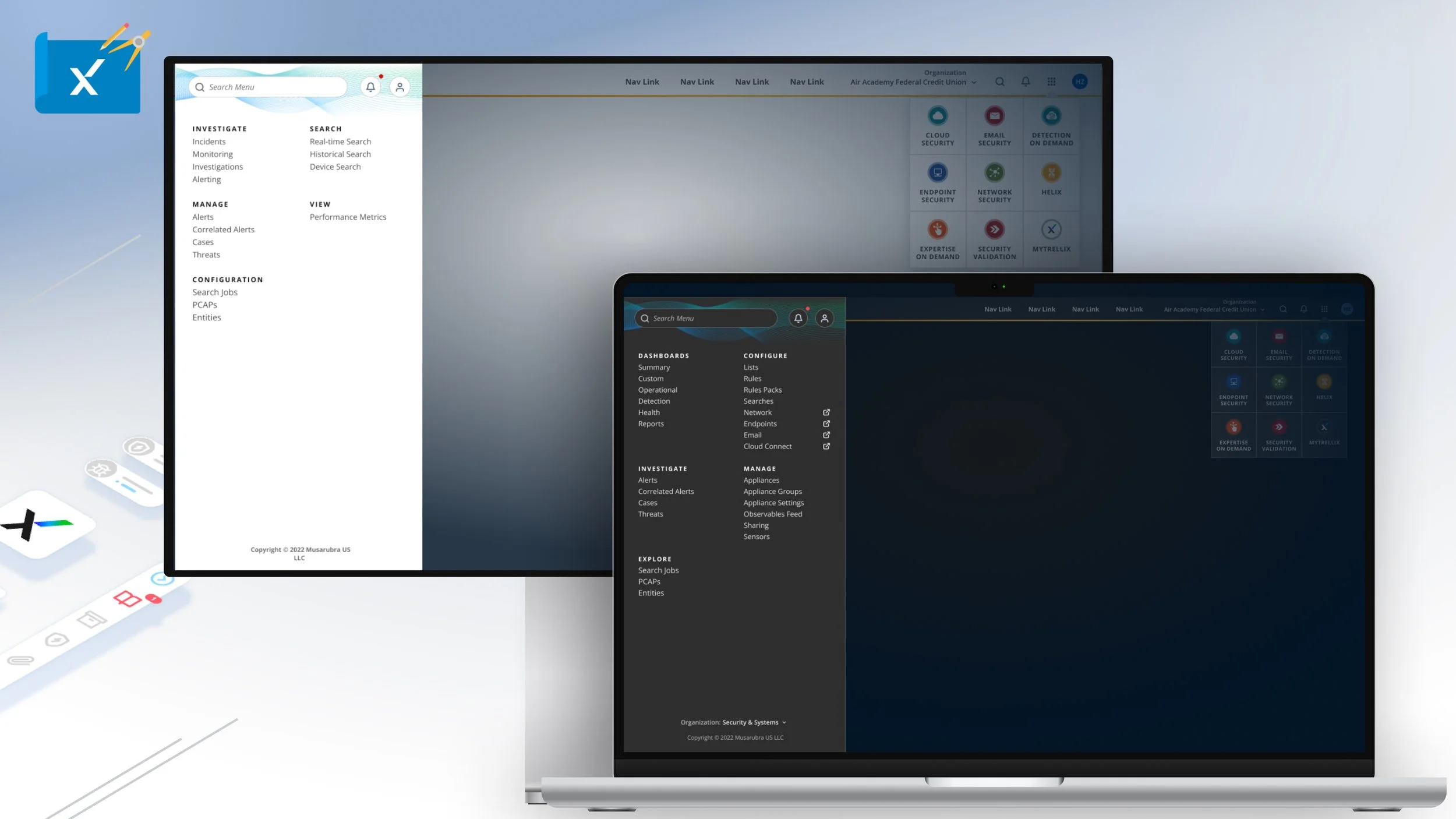
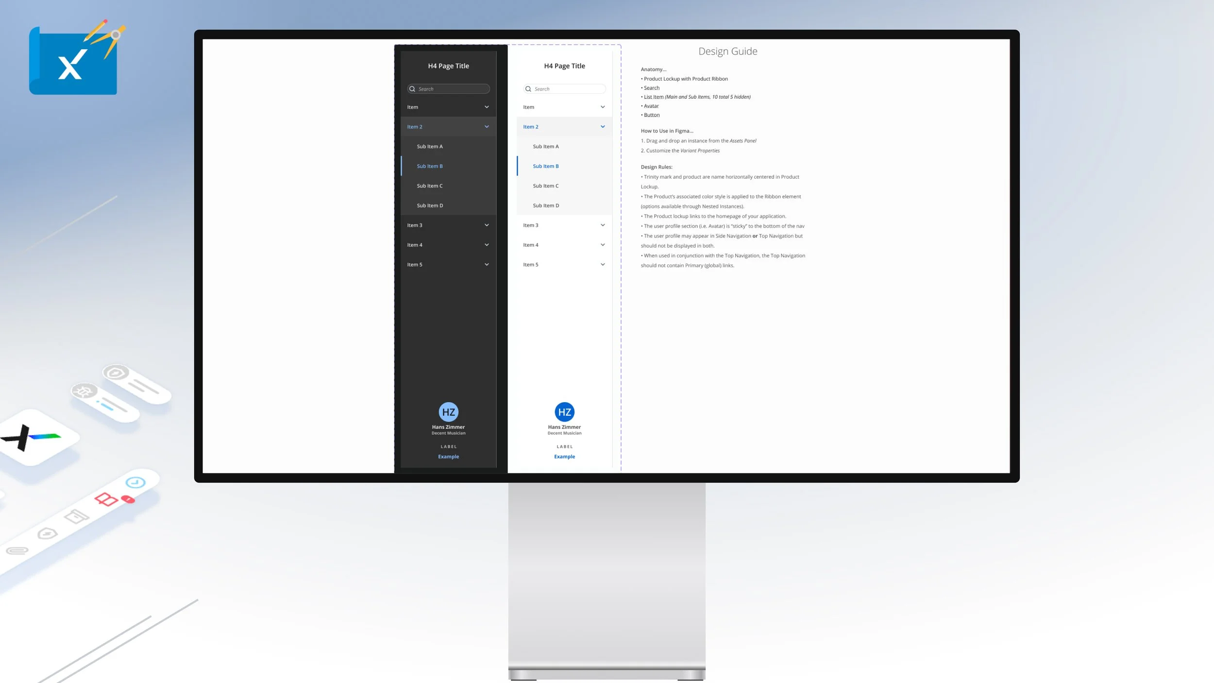
The Side Navigation is secondary navigational component to be used within contextual in page selection. It has search and user based settings if need be.
NOTE: CLICK ‘+’ BUTTON IN THE UPPER RIGHT CORNER TO EXPAND
The Sign In Component is a form field grouping meant to only used in login experiences with supporting user initiated descriptions and actions. There are eight types or Sign In components.
NOTE: CLICK ‘+’ BUTTON IN THE UPPER RIGHT CORNER TO EXPAND
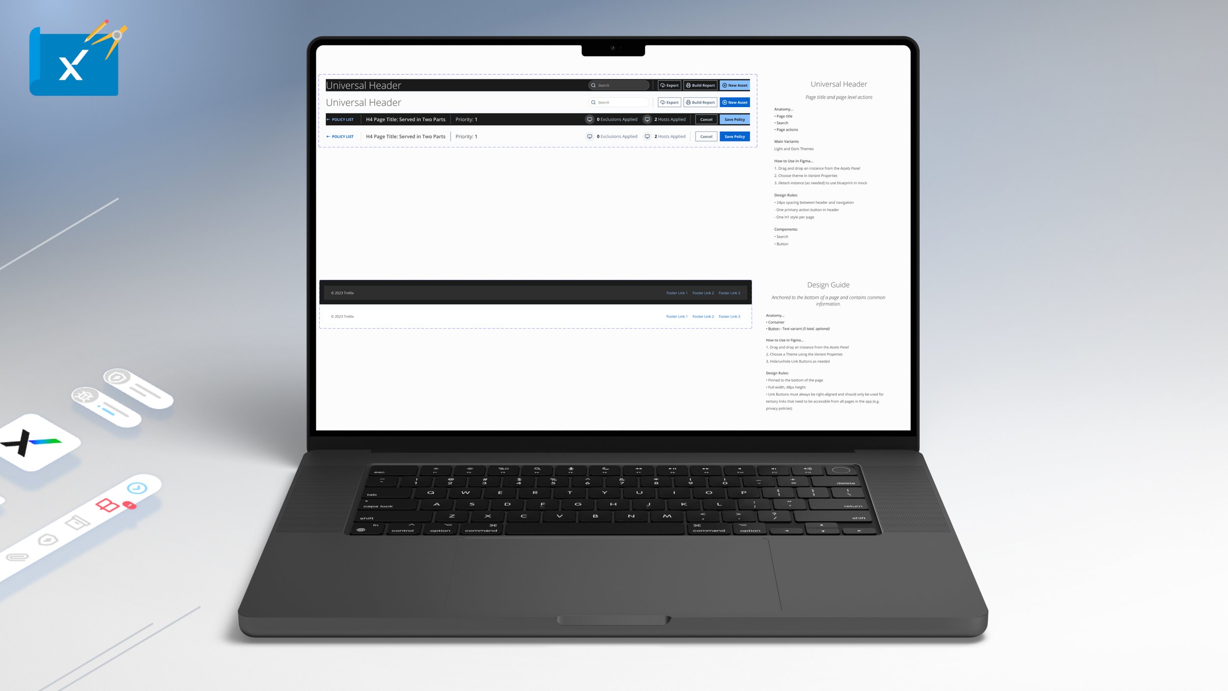
The Universal Header Component is a meant to display page titles, key data and information, breadcrumbs and page level actions. There are two main types to use.
The Footer Component is anchored to bottom of the page and displays, tertiary navigation, common and copyright company information.
NOTE: CLICK ‘+’ BUTTON IN THE UPPER RIGHT CORNER TO EXPAND
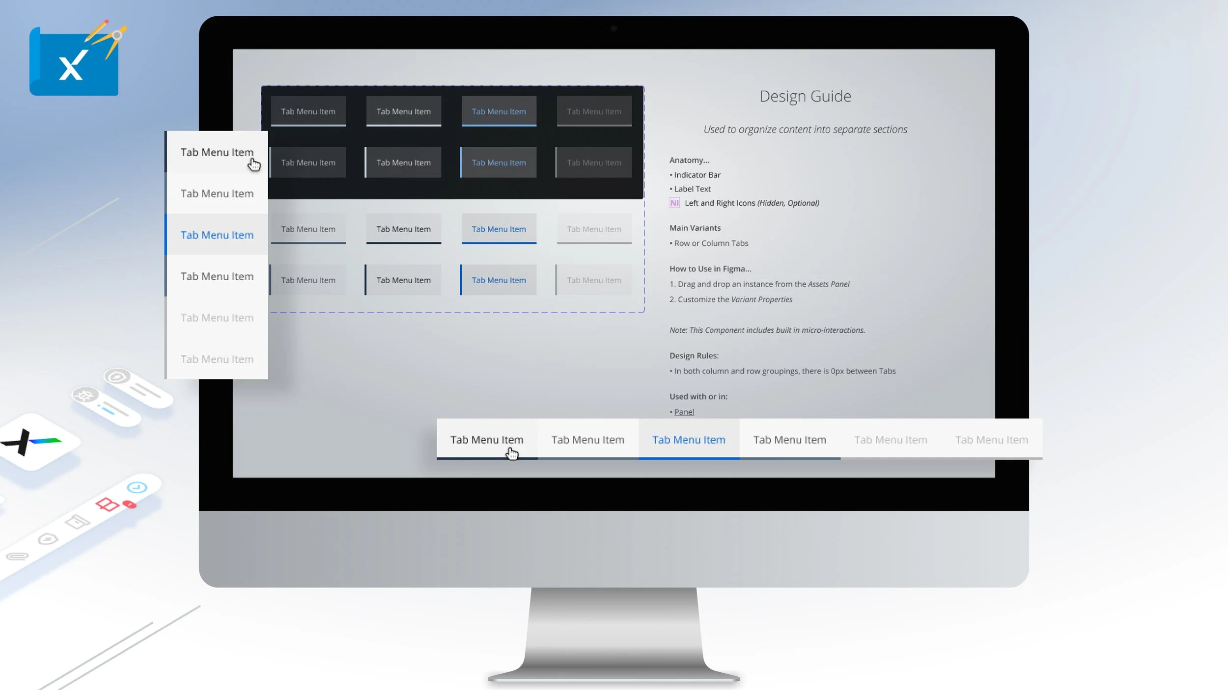
The Tab Component is used to organize content into separate sections for users to take action on. Typically implemented within the Panel component as row and column grouping variants.
NOTE: CLICK ‘+’ BUTTON IN THE UPPER RIGHT CORNER TO EXPAND
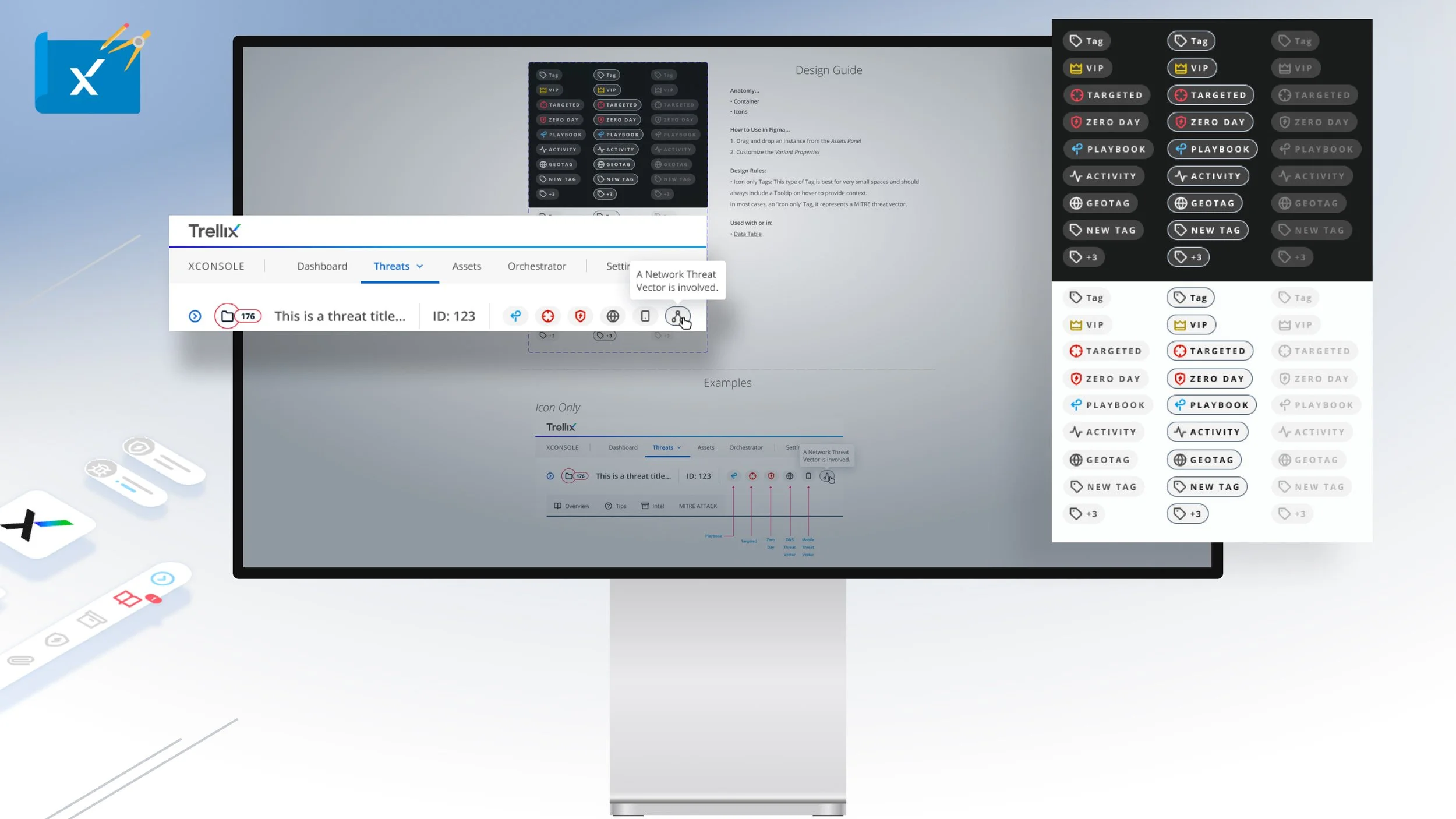
The Tag is an actionable component manifestation of Muse icon langue and should always be implemented in conjunction with a Tooltip.
NOTE: CLICK ‘+’ BUTTON IN THE UPPER RIGHT CORNER TO EXPAND
The Toggle component is a UI control that has two mutually-exclusive states, such as ON and OFF - a digital on/off switch. It prompts the user to choose between two mutually exclusive options and always have a default value with four component types.
NOTE: CLICK ‘+’ BUTTON IN THE UPPER RIGHT CORNER TO EXPAND
The Tooltip component is a brief, informative message that appears when the user interacts with an element in the UI experience. The Tooltip is initiated in one of two ways: through a mouse-hover gesture or through a keyboard-hover gesture and can be closed manually.
NOTE: CLICK ‘+’ BUTTON IN THE UPPER RIGHT CORNER TO EXPAND
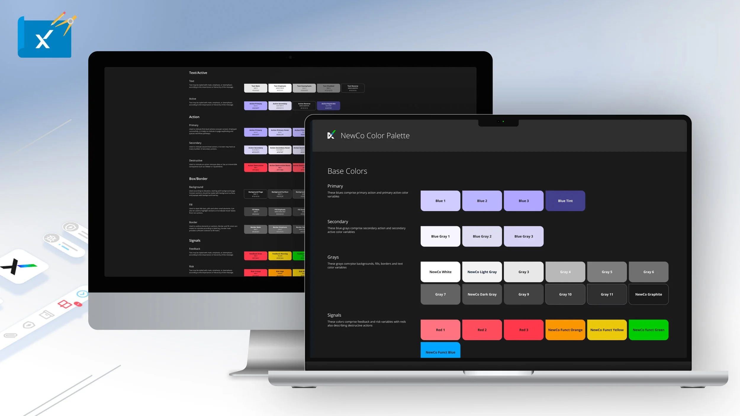
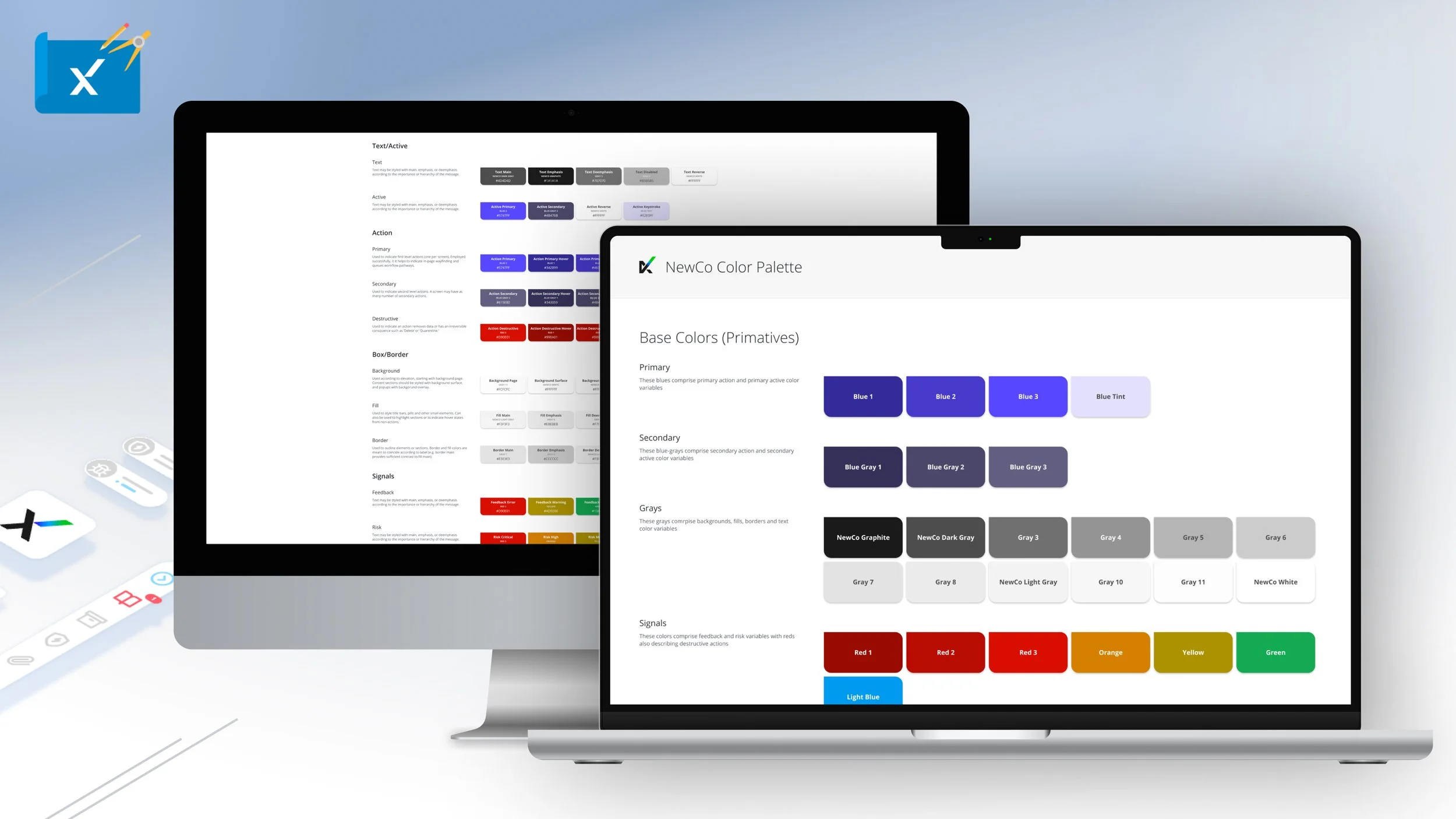
The Muse Dark Theme is typically the default color palette for the majority of Trellix products. Based on and expanding upon the Trellix brand colors the dark theme is organized into base, text/active, action, box/border, and signals are all WCAG AAA color contrast ratio compliant.
NOTE: CLICK ‘+’ BUTTON IN THE UPPER RIGHT CORNER TO EXPAND
The Muse Light Theme is a secondary and new color palette for Trellix products. Based on and expanding upon the Trellix brand colors the light theme is organized into base, text/active, action, box/border, and signals are all WCAG AAA color contrast ratio compliant.
NOTE: CLICK ‘+’ BUTTON IN THE UPPER RIGHT CORNER TO EXPAND
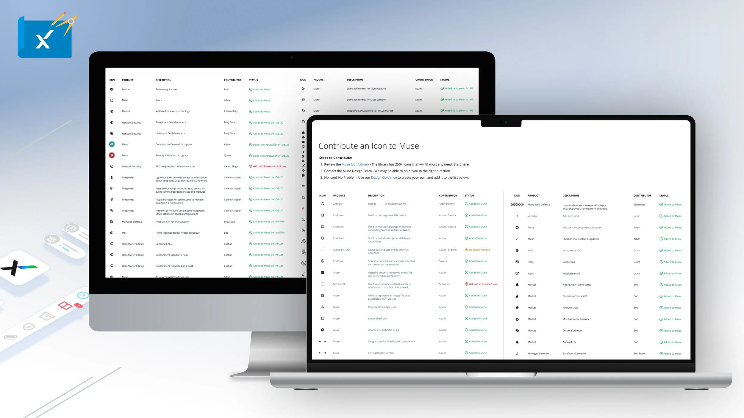
The Muse Icon library and langue is a unique custom cyber security that is an industry first. For the purposes of consistency and learnability across products - each of the 215 searchable icons has a clearly defined usage.
NOTE: CLICK ‘+’ BUTTON IN THE UPPER RIGHT CORNER TO EXPAND
To accelerate the growth of the Icon Library and to accommodate the growing needs of Trellix product teams, the team encouraged icon contribution. We provided a comprehensive guide on how to design and submit new icons to be included in Muse.
NOTE: CLICK ‘+’ BUTTON IN THE UPPER RIGHT CORNER TO EXPAND
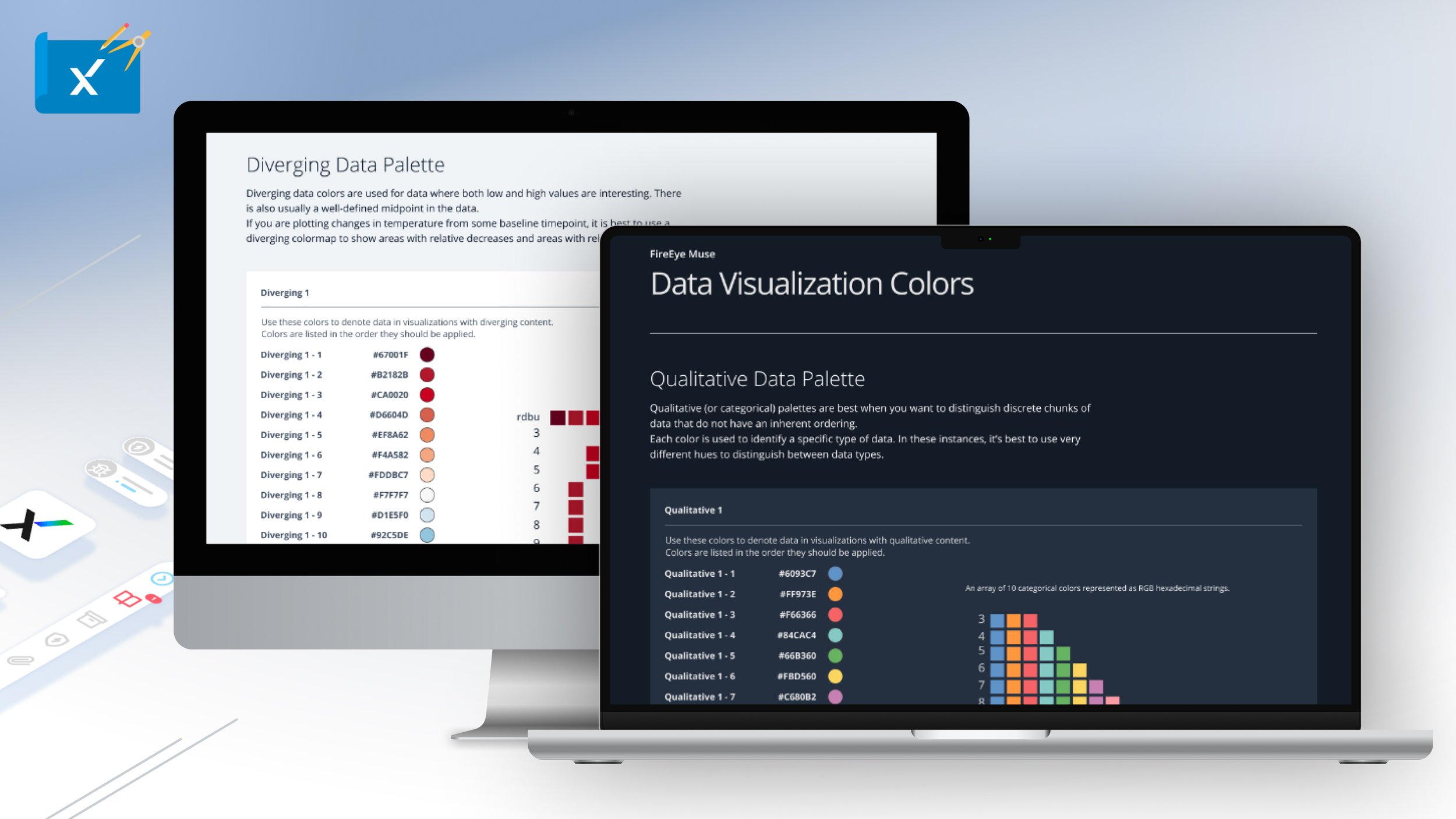
Based on the D3 data visualization structure, the Muse dark/light themed data vis color palette. A further expansion of the Muse color palette, colors are aesthetically brand forward and are AAA WCAG compliant.
NOTE: CLICK ‘+’ BUTTON IN THE UPPER RIGHT CORNER TO EXPAND
To create further efficiency leveraging Muse React library for new Trellix product experiences, Muse provides a Dashboard builder that has customizable patterns made up of common data content block types a Chart.js data visualization widgets.
NOTE: CLICK ‘+’ BUTTON IN THE UPPER RIGHT CORNER TO EXPAND
Another Muse React specific tool that is provided to developers is the page builder. The most ubiquitous product pattern types are represented within the tool and are easily editable and have hooks to XConsole architecture backend data streams.
NOTE: CLICK ‘+’ BUTTON IN THE UPPER RIGHT CORNER TO EXPAND
Within XConsole or Muse Advance, the UI Kit Builder Tool is included to get UI developers up and running using the entire Muse React library.
NOTE: CLICK ‘+’ BUTTON IN THE UPPER RIGHT CORNER TO EXPAND
Design tokens are a single source of truth to name and store design decisions for Trellix product experiences. The Muse dark and light theme are represented in code as token color variables.
NOTE: CLICK ‘+’ BUTTON IN THE UPPER RIGHT CORNER TO EXPAND
Animation is implemented throughout most Muse components and there is in depth documentation on how to apply animation guidelines throughout all product experience. Additionally, all animation principles are embodied in the form of design tokens.
NOTE: CLICK ‘+’ BUTTON IN THE UPPER RIGHT CORNER TO EXPAND
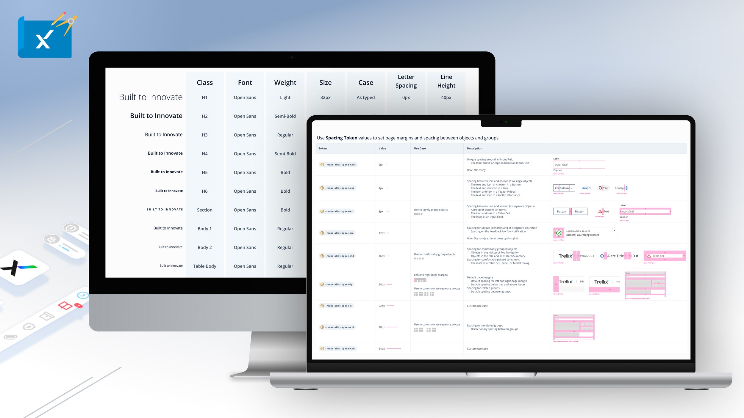
To empower UI developers, the Muse Design System’s layout grid and font sizes are all in the form of design Tokens.
NOTE: CLICK ‘+’ BUTTON IN THE UPPER RIGHT CORNER TO EXPAND
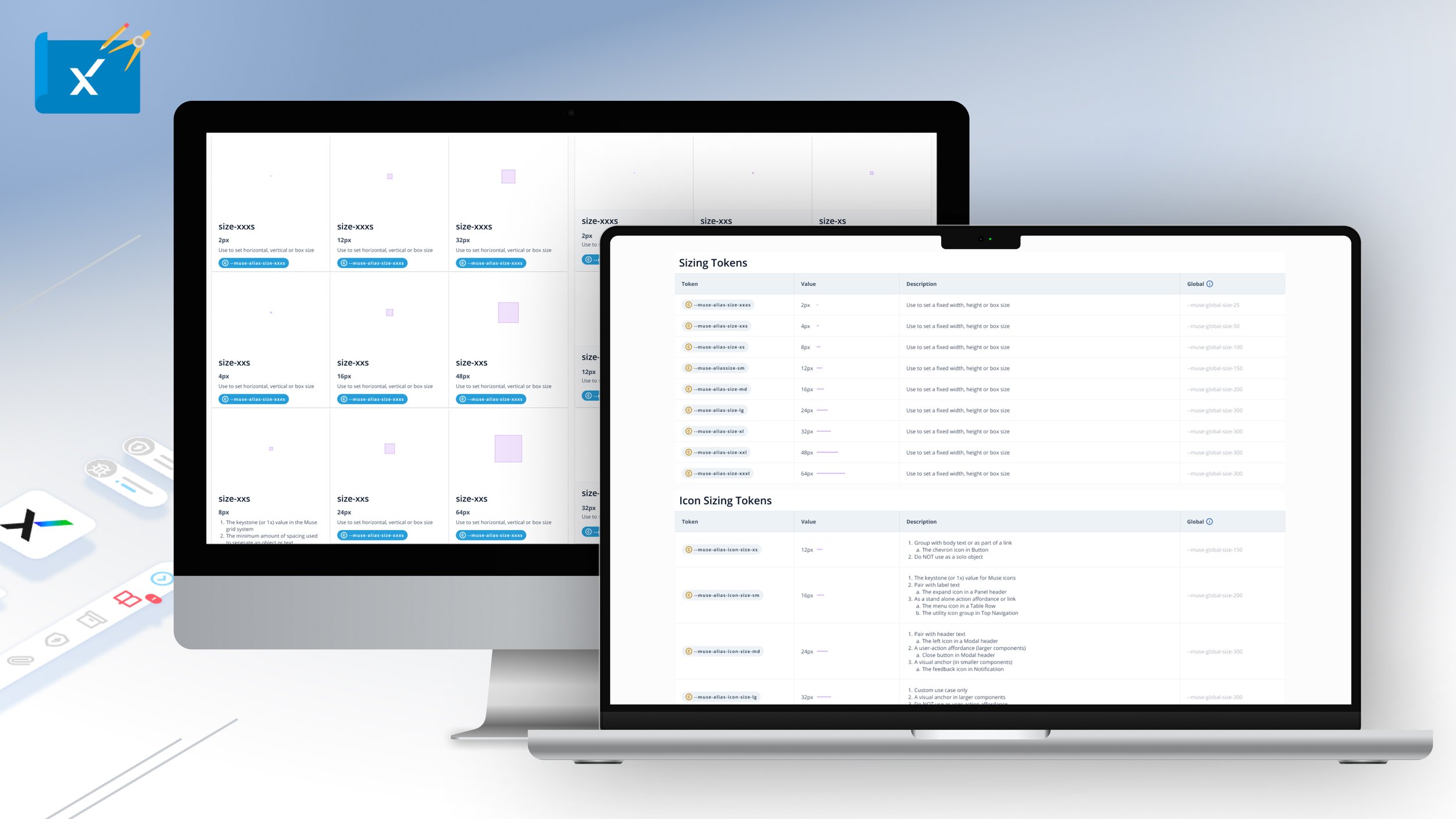
To empower UI developers, the Muse Design System’s sizing and icon sizes are all in the form of design Tokens.